Showing posts with label Concept Development. Show all posts

Monday, 18 February 2013

Developing a Different Aesthetic Feel

Recently I started to refine the art assets for the game Destony after getting feedback that the level art was clashing with too many bright colours  so I spent some time doing some concept art and developing the overall style so that it would be less intrusive on the eyes. I actually got really inspired by the art of the indie game 'Element4l' that really summed up a nice colour scheme that I was thinking of going for, the image bellow displays my inspiration:

Element4l Teaser


Here is the process of my concept art within Photoshop CS6. I was testing out some new brushes in Photoshop which gave me some really interesting results in the overall image and also quickened the process of my vision being made in reality. These brushes included, lightning, grass, landscape, cloud and grit.   

Started off by painting out the background using many cloud brushes as well as effects brushes which definitely save time and I see why people use them so often.

Then the mountains and foreground were added to see what the overall composition looked like.

Something didn't look quite right with the mountains, so I removed the foreground to see what it was.

After adjustments with the background, I created the character using a single rounded brush.

Here I started to create a  glare for the sun.

A close up of the ground which is fairly detailed.

A close up of the light box which it was important to balance the light so it would not disappear. 

A close up of the character without the rain effect.

Final Image


My Thoughts

The final result shows the combined image with all the assets. Overall I was quite happy with the results. The new brushes I downloaded made it a lot quicker to get the desired effects I was going for. The moodis set to be dark to emit feeling of grand intention or determination. The colours are high contrast to bring out the main features. I played around with the character design a little to see what other effects I could achieve in adjusting him slightly and giving him a more realist look.


Pros:

  • The colours of the image compliment it very well due to the strong darkened sky which pops put the main character and the subdued mountains to portray distance. 
  • The character pops out of the image as intended and the bold outline somewhat suits well with the dark atmosphere.
  • The image serves it's purpose of showing emergency and something grand soon to take place.

Cons:

  • The character lacks a lot of detail in comparison to the actual background and effects surrounding him, particularly with all the harsh straight lines whereas the environment is a lot more soft.
  • The character does not fully look as if he is looking at the light box as intended.
  • The mountains do not have much presence within them and could possibly do with more painting adjustments.
  • The background might be too dark which brings it forward as opposed to back.

Possible Improvements:

  • Nothing too striking here that needs immediately needs changing, although the character could do with less harsher lines and the gradient in the sky needs to be subdued. 

Tuesday, 12 February 2013

Creating Subtle Shadows with New Copic Markers

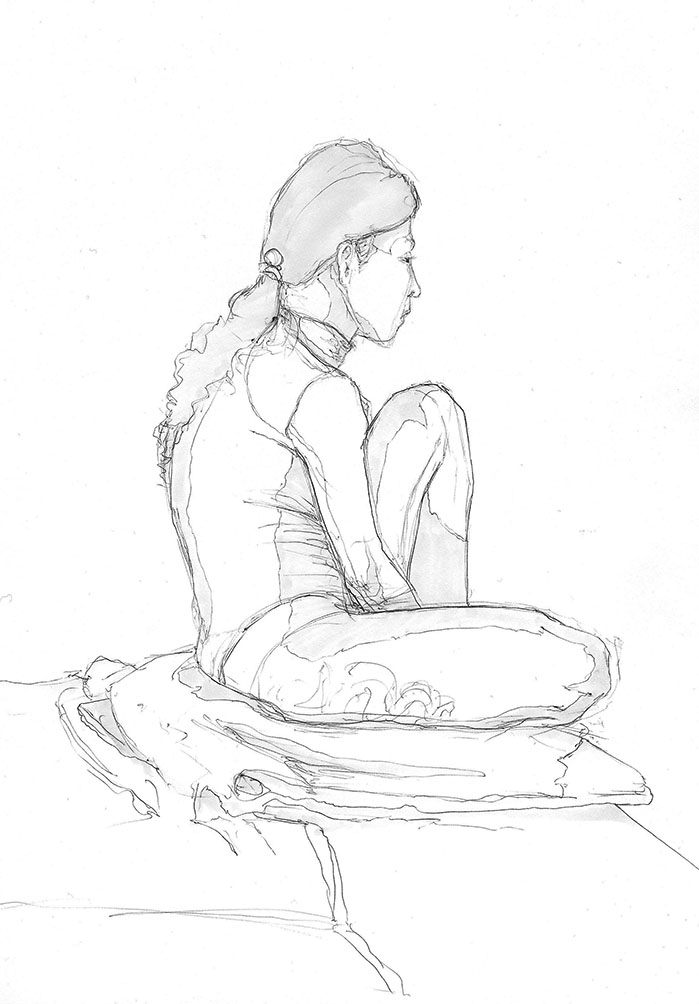
As the same as last year, I am trying to keep up with my personal development work. Here are some drawings I did for Life drawing which I try to attend every week. Looking back now at the drawings I have, I can see that I am improving my general skills and feel a lot more confident that I am able to draw anything I set out to draw. I remember in the past, I always found it to be a struggle to actually develop and establish a certain style, although looking at my drawings bellow, I feel that I finally have an art style, which is based on using thin lines and soft tones to establish the image.

I recently bought a set of grey scale COPIC markers which have been a great help in establishing a deeper and eye catching image. It really makes the image pop off of the page and really adds more interest to the image. I found it amazing how such a simple addition to the page could create such meaningful results.

The above image was a 15 Minute sketch of another sketch in the life drawing room which displays 3 figures which were expressed so well and their dynamic poses with minimal line-work which I thought worked really well.

The above image was of the model Olympia which I felt I was really happy with, it was a 15 minute pose but I really felt that I captured her anatomy correctly and it really has some life within it. 

 The above sketch was a 15 minute sketch of the model in a very interesting and challenging position, although somehow it turned out really well and I was really happy with the final results. The subtle lines that were drawn and the overall composition and use of colour made this turn out quite strikingly.    
The image above was of the model standing up and was another 15 minute pose. I was happy with the way this one turned out and the dark grey shading of the hair turned out really well and brought more depth to the image.


The image bellow was a quick sketch of the lecture environment and the first proper time I used the COPIC marker pens and they really do bring great results and I plan to use them as a congruent theme throughout this year's sketchbook.

Friday, 1 February 2013

Life Drawing: Addressing Skill Gaps

Further life drawing personal development. 

These sketches were done to focus on particular skill gaps. 


The hands in particular, many find extremely difficult to draw, I myself find them hard to draw in terms of being believable with no references. 

Why do people struggle so much with hands?

People struggle to draw hands effectively due to their detailed nature and unpredictability. Unpredictable due to there being five fingers which must all be considered in terms of angle, perspective and length. It is hard enough to predict what the perspective of a single object is, so when dealing with five fingers it can get tricky.

My Solution:

My solution to this is to draw the palm of the hand first, then to branch off five fingers as blocks with two pivots within it. This way, if you get the palm right itself, it's just a matter of thinking about how far certain fingers can bend and then deciding what type of hand you are drawing; a soft feminine hand, a strong rough masculine hand etc etc. 


A comparison sketch of the same person, one done in 15 minutes and one done in 5 minutes.

Observational drawing from a  side on angle which I sometimes struggle with, particular with the features of the nose and lips. This was a rather successful attempt. 


An observational drawing of female, this one in particular I was focusing on shading and lighting which I sometimes struggle with, this turned out fairly successful as I created a lot more softer shadows.

Monday, 28 January 2013

Researching Mechanics: Creating 'Depth'

A great Gamasutra article talks about the depth of a game mechanic and what really brings an emphasis to what a great mechanic is all about and how those aspects can be amplified. I feel that it is important to experiment with certain game mechanics and see what really makes them 'click' and draw the user into played a game. Coming to think of it, there have been so many games with so many different game mechanics which each create a different aspect for the user to feel accomplished or to feel a certain depth within the game.

The article opens up with explaining how games often look great on paper, but when you test out the game to see how it plays, games often end up feeling repetitive and needing more variety, that is probably one of the hardest things to master in game creation, the question now is, how do we master this.

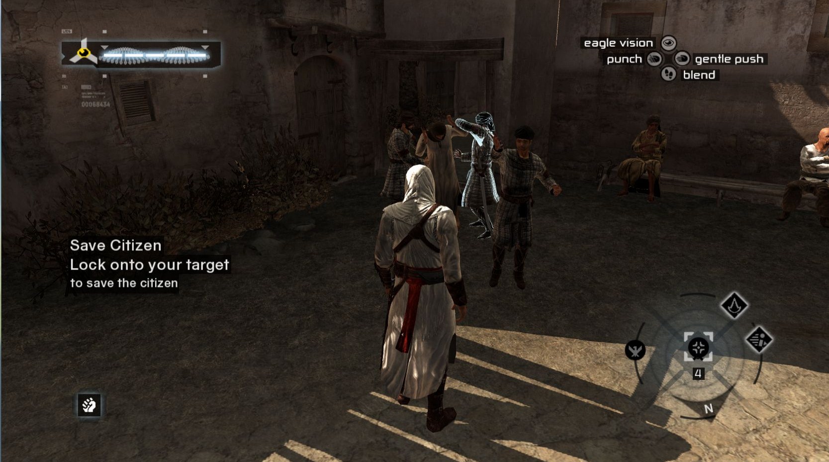
As explained within previous research, a lot of this is to do with the actual challenge you present the player, if it is not challenging enough or engaging enough, the user will lose interest. A great example of this for me was within Assassin's Creed on the Xbox 360, I remember being really excited to first start playing the game and then as I started to play the game for a few hours, I got hit with feelings or boredom and repetition as the whole game was just about doing the same exact thing over and over again multiple times without much variation or increased challenge.

Assassin's Creed experience of repetition
The main game mechanic within Assassin's Creed was within the stealth kill or assassination of the enemy, this is what would bring about a great sense of pride and establishment for the player as they feel that they have conquered the enemy and achieved a great feat by not being seen. This got repetitive because I felt that even as I was doing this over and over again, the thrill of the first kill was diminished by the same thing happening over and over again and little change within the game environment or difficulty. 

In the Gamasutra article it defines the method to solve and it also explains why this problem often occurs.
  • Buzzwords to watch for: The game is "a one-trick pony," "repetitive," "or needs more variety."
  • Feedback that can be fixed with these kind of content expansions tends to describe the game as a whole. Players feel they don't have enough different things to do on a global level.

The ways that Gamastura suggests in general to solve this is:

If players feel that an individual game mechanic is flat and unrewarding you can refine that mechanic's "theatrics" by giving the player better feedback, more rewards, better effects, cooler sounds, more personality, a cooler camera, or other bells and whistles. After theatrics refinements, players will often -- with no changes to the underlying gameplay -- tell you the problem is fixed.


So the whole point of this is that if your users or testers do not find much fun within your mechanic or find it boring after a few goes, then this is the issue, the game mechanic needs more depth. The whole article goes into detail on how you can prevent 'Shallow' game mechanics which cause games to be boring, flat or repetitive.

In the article, he goes on to explaint that there are two things that are needed in order for the game to achieve any depth within it. These are:

  • It needs clear objectives, so the player knows what he has to do to succeed. Confusion and obfuscation tend to make players feel like a mechanic is LESS deep once they find themselves needing to experiment randomly to win.
  • It needs a variety of Meaningful Skills that you, as a game designer, can use to create good challenges for the player and that the player in turn can use to achieve mastery over the game.


So those two things are 'Objectives' and 'Meaningful Skills' which define and create the game to make it what it is. The separation between these two aspects are probably the most important things within the design of an in-depth mechanic.

A good example they make; is where if the mechanic is just a means to do an objective and has no meaningful skills, then it sort just dismisses the purpose of the game. The objective cannot be a brain dead activity of getting form A to B but has to invoke the player to display a certain amount of skill, meaningful skill.

At the end of the day, meaningful skills contribute much more to deep mechanics than the objectives within the game do. 

So that means that most games that don't feel deep enough feel that way because they have way more objectives and not enough meaningful skills. This is exactly why Assassin's Creed was boring, it kept repeating the same objectives over and over again and had little skill change involved to make the game interesting enough for longer periods of time.

The article then goes on to explain activity statements which involve naming what the meaningful skill is and what the objective is, and if it is too vague, the gameplay often suffers.

Here is the five step process which he explains:

1. Identify and list your objectives.
a. For each, ask yourself: "Is this objective functionally a duplicate of any of the other objectives in my list?" If it is, ask yourself if you really need it. Do you really want to spend the time on teaching your players how to interact with it? If the answer is no, cross it out.
2. Identify and list all your meaningful skills.
a. For each ask yourself: "Is this really a meaningful skill? Not too basic? Not an objective?"
b. Ask yourself: "Is this skill functionally a duplicate of any of the other meaningful skills in my list?" If it is, cross it out. You're tricking yourself into thinking you have more skills than you actually do.
Having taken stock, do you now find you have too many objectives? Not enough meaningful skills? At this point, I'll bet you've discovered that, yes, somehow that's happened. At this point, just do the same exercise I suggested above to help my past-self get over his tractor beam problems:
1. Add one or more new meaningful skills to the list.
a. As you add them, ask yourself the same questions as above. "Is this skill really meaningful? Is it too basic? Is it really an objective?"
2. Go through all your challenges and improve your Activity Statements
3. Prototype the new content.
4. Play-test. Is your problem solved? If so, then you're done!
5. If your problem isn't solved, go back to step 1 and try again.

This has been rather insightful, I'll definitely continue to read articles on 'depth' and what influences the mechanics within a system.

Tuesday, 15 January 2013

Game Comparison: Retro VS Modern

As said in my proposal, it is very important to access the aspects of the effectiveness of the mechanics and the aesthetics. Throughout this pre-production process of creating these two prototypes and comparing the art, it was obvious that the aesthetics of a game actually influence the overall experience. This will be a critical analysis of the two games and will access the pros and the cons of the different styles.

The Menu Screen


As you can see, the above images of the menu screen are fairly different in their appearance. The BlueBOX game displays an image of the character which blinks as it sits still. The font is also very different and gives off a very different aesthetic image to the users. I personally prefer the Destony menu screen as it is very modern and stands out, although it could do with an animated background or subtle movements to increase it's overall visual appeal. 


The Rules Section


The retro screen has very obvious arrows which to some may challenge the users competence, which is why they were removed in the screenshot bellow. Overall they both fulfill their purpose and display rules of the game both very clearly. The modern assets replace the older ones and have a lot more character to them.


Level 1 

Now getting to the actual meat of the game, we come to the actual gameplay of the games themselves. Yes, the framework is the exact same, although the actual experience is changed simply by a change of art, and this seeks to extrapolate and discuss this.

The first thing that I noticed was that the Box platformer character moves around in a very comical way and has a lot of comical appeal in their aesthetic appearance whereas the Destony character moves around a lot more smoothly and has a much more organic feel. Both games have a very nice feel and have a certain amount of polish. Playing level 1 I noticed that the ground was effected by the platform detection system within Destony and the ground changed to being quite rugged and bumpy in which added some depth to the gameplay.


Walking Animation


Comparing the walk cycle from the retro to the modern, playing the cycle within the game you instantly notice that the box walk is extremely limited as the box has no legs and just sways side to side. Thomas was alone goes a step further with this simplicity in which there is not cycle and the square glides across the floor.

It is clear that having a walk cycle and also an added shadow brings a lot more realism and somehow brings more visual value and a sense of fluidity.


Jumping Animation


The jump animation in the retro image is less realistic although is actually in my opinion a better jump, it gives a comical and satisfying sense within the jump, so noting this it might be best to try and add comical aspects to the characters jump. 


Crouching Animation


The crouching animation is again suits the retro side of things more as it holds that unrealistic comical sense of squash and stretch which could be used for the Destony character as well. The crouching within the game on Level 4 actually requires for the Retro Box to duck in order to reach the portal, although due to the size of the Destony character's head, the crouching didn't make much of a difference and thus the platform was lowered to allow easy access to the portal in Destony Level 4.


Level 3


Notice within the new image above that the shadow is still present when the character is in midair which is a fault that can be fixed with some research in order to only have a shadow when the character is on the ground. Within Level 3 the atmosphere really looks quite different compared to the retro version and the mechanic of jump and the angle of the platforms are effected by the extra height of the Destony character and the bumpy platforms.


Level 4


As said previously, the last platform on level 4 on the right requires a crouch manauver in order to enter the portal, although on the modern version of the game, it was not necessary as the ducking made little difference to the characters height. Although some tweaking in the characters animation could easily change this. The different of the characters and the background give this particular level a lot of appeal in the modern version.


Level 5


Within the 5th level, there are finally some diagonal slopes involved which are very straight within the retro box version of the game although within the Destony version they are still bumpy and this gives a different effect when going down the platform. This in my opinion didn't feel too different when everything was already so unstable, although in the retro version it gave a new feeling of slanted discovery.

Evaluation

Mechanics: Upon evaluating the overall performance of both games it is obvious that which one would be perceived as 'better' would be purely based on opinion. In my opinion, the manipulation of mechanic which really shined through is within the jump function within the last levels of the game. I actually found that the jump feeling on the 6th level to be highly satisfying and rewarding within the retro game, although the accuracy and the precise factor of the game is effected by a lot of the messy collision/connection detection of the art work, so I would actually say that the mechanics that are kept simple actually feeling better overall.

Aesthetics: As for the aesthetics, I would say that the overall appeal and feel of the BlueBOX platformer is a more complete retro experience than the half formed Destony prototype and that there is a lot of potential within the experience of this prototype although there is much that need to be tweaked and focused upon to bring this change. By in large I think that the Destony game has a substantial amount of visual appeal and definitely would bring a lot more interest to most audiences in my opinion and experience. The character moves a lot more smoothly within the modern version and have a lot more professional appeal. Although the sound and music I feel suits the BlueBOX a lot more, this could be adjusted with a more atmospheric and less upbeat and high sound during gameplay. Both games are fairly polished as prototypes and display the sheer potential that subtle changes within the art and sound can make a difference.

Overall, it is clear to me that BlueBOX game is more complete as a prototype and that the aesthetic experience really suits the game whereas the Destony game still has much to be fleshed out and polished before it can stand alone as a unique and cohesive experience. In saying that, the mechanics seem to be amplified when aesthetics are kept simple and upgrading aesthetics brings a lot more fluidity to a game. 


Sunday, 13 January 2013

Mechanic Development: Prototype DESTONY

After creating BlueBOX platformer which was a very basic platforming game which I managed to code myself, it was time to test out the same game fundamentals with more polished art to see if it really makes a difference, so I used the art assets of the concept art and created new assets to polish the game and see how it comes across.

Creation of Level 1: replacing old art

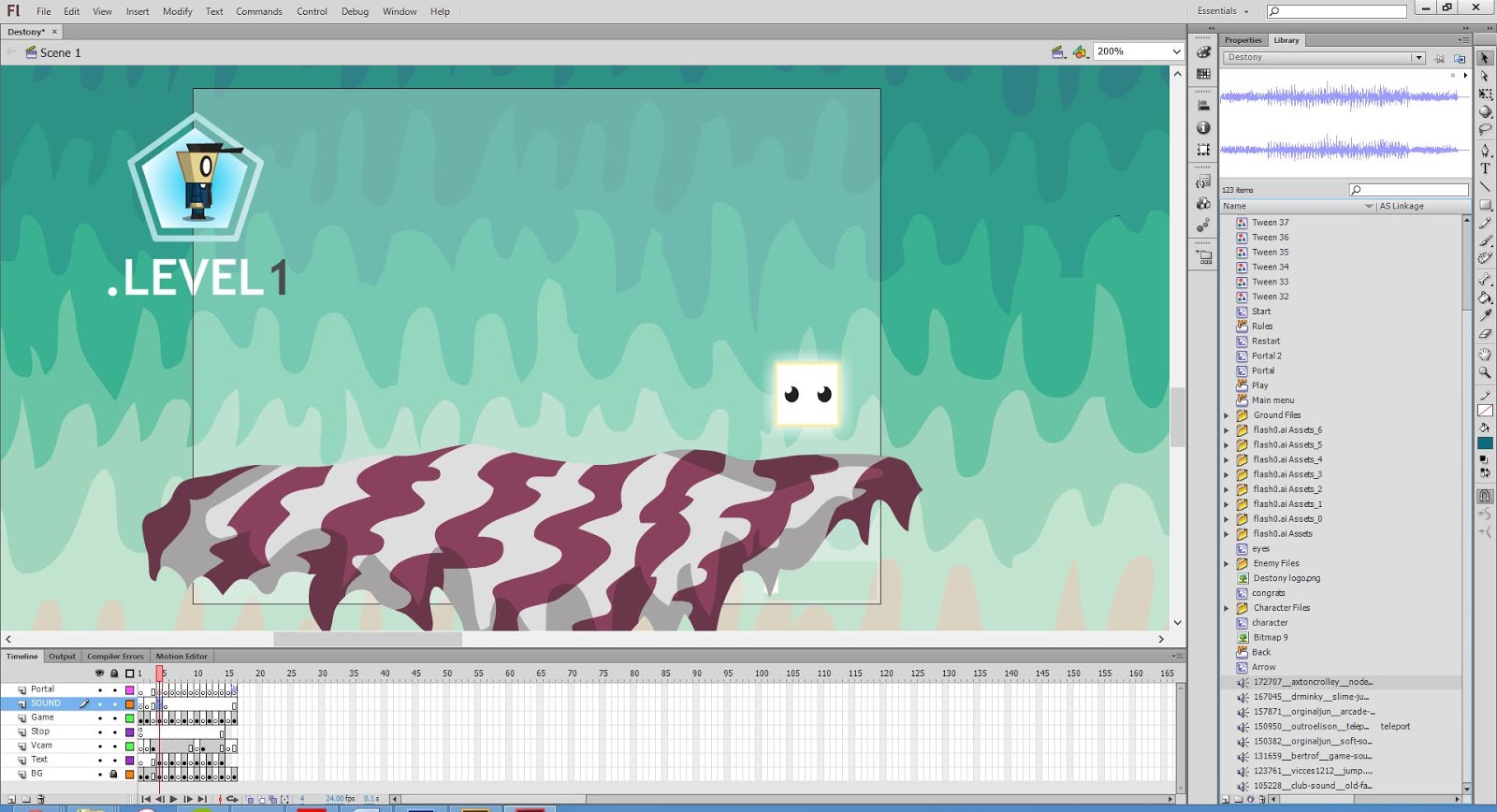
In order to get the new game with the new art running, the process consisted with changing the art assets that were embedded within the movie clips and replacing them with the newer assets.

Creation of Level 3: shifting platform positions

Here I was changing the assets within Level 3 and adjusting the Vcam within the game.

Creation of Level 6: duplicating platforms


This was adjusting level 6 which had the most platforms so took the most amount of time to adjust and change.

Menu Screen: much more vibrant

As you can see the opening screen is a lot more vibrant and catching than the blueBOX Screen.

Rules Screen: less busy and more simple

The RULES screen is also a lot more vibrant and the design is lot less in your face than previously.

In Game Testing: The game played quite differently

Overall, when playing the game with the new graphics, I noticed a lot of differences within the gameplay, the character felt different when moving around and the whole game experience was a bit more versatile.

You can play the actual game with the link bellow:

Destony Platformer Game Link


Upon evaluating the whole game experience, it was obvious to me that the graphics do effect the gameplay, the character moved around differently and the game gave a different vibe when being experienced. Because the ground is formulated by relating the main characters spacial surrounding and then combining that with the floor, you often can get glitch effects within the interaction of the two objects within the game.

This I found to be particularly true within Level 6, when the character tries to jump on the various platforms, you can see how the character is effected by the angles of the platforms and how he doesn't just travel directly upwards.

Overall, the game does play differently and looks a lot more polished, although from my evaluation I feel it is fair to say that the overall gaming experience is pioneered by the gameplay and primarily how the game has been programmed, which is what I really want to focus on in more depth within the 2nd semester of this project. Overall, I am happy with the transfer and how I learnt so much from this process and it is time to use what was learned a create a new developed experience. 

Friday, 11 January 2013

Unite with Unity


So after a lot of browsing, I have decided that for my honours project, I will be using Unity to create my 2D platformer, it took quite a lot of convincing but after some research and actually using Unity itself, I found out how it's a really straight forward piece of software and is far more powerful than Flash is in terms of it's capabilities. So because of this I thought it was worth getting involved with and finally uniting with Unity.

This was the post that changed my mind:

Unity London Meet: Creating 2D Platformers


In the above talk which is in the link, Tom Jackson AKA Quickfingers talks about game development and how he got into it. He started out as a graphic designer within the games industry, then he moved on to designing video games starting out with using flash. His games were successful gaining millions of views, so he decided to take it up more seriously and got jobs as a programmer and designer. He later discovered Unity and stopped using Flash due to it's cross-platforming ability and it's huge database of knowledge and user help.


Quickfingers created the above game 'Boom Bugs' using Unity and changing the camera to a front on view which makes the 3D planes with 2D images on them look like it is a 2D game, he explains in detail how it is built and that it also runs on Unity's physics engine. All of these things are the reasons why i feel unity will be a great place to start in creating a more in depth game and also Thomas was Alone by Mike Bethel was also created using Unity. 

Using Unity


After playing around with unity for a while, I created a simple platformer character and also a pause menu and I found it fairly easy to use, especially being the first time. Unity is easy to use although like every game developing software requires the user to know how to code certain aspects of the game which will be my biggest struggle, although with the Unity community support and sheer determination, I feel confident that I can produce a high quality game after much iteration.