Showing posts with label Honours Project. Show all posts

Monday, 20 May 2013

Destony Game Trailer & Presentation Done!

One step at a time...

I just had my presentation today and I spent a lot of time preparing for the presentation and stressing out about it as there was just so much to cover that I have done over this year and I find it really hard to do with just 10-15 minutes. Particularly because my project is so broad and based on 'Game Aesthetics' although i managed to put together a presentation which i am proud of and it went really well and I managed to answer the questions in a clam and intellectual manner so I am overall quite pleased. Some feedback I received was:

"Great work on the game, everything was polished to a high degree"

"Aesthetics is a problematic word as it is very subjective"

"Would like to know how you managed to get to the certain art style you developed in more detail"

"A great critical framework, to be able to have a criteria so specific is great"

On top of that, I managed to create a more succinct trailer of my game which showcases the game in 2 min 30 seconds and shows it in it's best light. The trailer too me a whole day to create although it certainly is worth it as my other video play through of the game was 9 minutes long. You can see the trailer bellow.


Sunday, 19 May 2013

Post-Inspiration: Dundee Showcase & Obsolete


DJCAD Degree Show 2013

After I handed in my dissertation, I went to visit the Dundee showcase in Dundee Univeristy in combination with Duncan and Jordanstones. In all honesty, it was one of the most mind blowing and eye opening experiences in which I saw a level of dedication to the arts and crafts from students that I have never seen before. It really put things into perspective for me that a University just a few meters away has so much talent and skill and makes me feel so inspired to keep trying and doing what I love as the students in Dundee are also doing.

Also, importantly  the showcase being 1 week before Abertays showcase allowed me to see what exhibitions would look like. I studied and took pictures of other peoples work and the way they set it up to help me again a better understanding of what looks better and how to present my work. One key thing that stood out for me was that most of their work was presented in a 3D way in which their artwork would pop off the wall due to their use of 3D foam square stickers, due to this I decided to buy my own and am excited for showcase day which is soon to come.

Although first my presentation is tomorrow and I have been working on my presentation since yesterday and am looking forward to it. The Dundee showcase video is bellow:


Vimeo Staff Pick - Obsolete


Obsolete from Smoking Robot on Vimeo.

I also stumbled upon this animation recently which I felt was really relevant to my game Destony and for future work for my game, I would love to use the same colour scheme and vibe that this short animation uses. It captures the exact feelings of trying to find the positives in a dark world and set yourself free. If I had more time, I would have loved to make a game out of these same visuals and the same emotive design, so this was a late inspiration but i thought it was worth sharing the visual significance of this.

You can see the screenshots of the animation bellow. The great use of colour contrast of golds and blacks.


Monday, 13 May 2013

Abertay Showreel, Time is almost coming to and End

My Work is in the Showreel

Time is most certainly coming to an end, the Abertay Showreel was just posted online and my work is also in it. As an artist, particularly one who animates, having a showreel is an essential asset in order to showcase what you are capable of. Fellow artists are not naive and can tell the difference from someone with experience and someone who is just starting out with being professional pretty quickly. 

Sunday, 12 May 2013

Honours Project Podcast: Getting Personal and Developed

This podcast is a bit more personal than usual, explaining things about myself and my growth as a student, a person and an artist. It can be quite the enlightened experience when you look back and see how much you have developed or improved in any professional or personal field. Listen bellow:

Podcast: Getting Personal and Developed


Saturday, 11 May 2013

Evaluation: Destiny of Destony

What was it like to Develop Destony and how were the Results?

Things are coming to a close and it's time to reflect on the whole process and development of my honours project. From what started as a simple idea has now come to fruition in a final developed game concept. In general, developing Destony was an educational and growing experience, one of which I feel I gained a substantial amount of knowledge and skill. The results were far more than I expected, having no coding experience I went in scared of ending up with nothing to show, although I managed to create a polished game with 4 levels, including an intro and an ending.

Excerpt from Dissertation:


Project Practice:

As aforementioned in the methodology, an interactive game, namely: Destony would be created with the purpose of incorporating the theories, principles, trends and information on game aesthetics focusing on the core systemic and visual values. The result of this was the created game aesthetics critical framework, and due to the systemic success of Thomas was Alone and the visual value of Tiny Wings, a lot of the core aspects of both games were fused into the creation of this game. As with Thomas was Alone, this would focus more on the polish of a simple concept, rather than an unrefined complex one, focusing on the feel and narrative immersive qualities.


 As a single developer with an artistic background, the gameplay design was minimal, consisting of a single jump mechanic and the interactive physics to move your surroundings and collect items. The game’s focus was on creating a compact experience which would represent the significant aspects of the systemic and visual, rather than creating a full game within the timescale. To incorporate the balance of challenge, small puzzles were incorporated to keep the users interest. To include freedom, the physics were enabled so that the blocks could be moved around and be unpredictable. The retention was sought after through collecting items as was the value. The immersive and feel qualities of the game were to do with the visuals of the character, the animations and subtle attention to detail.


The game was previously developed in flash a 2D engine, but was then recreated within Unity for the flexibility and the in more appropriate physics engine. During development, many decisions needed to be made for the betterment of the gaming experience. One of the first decisions that were encountered was whether the game would be 3D with a fixed front view (2.5D) or just 2D planes with a fixed front view. It was soon established that having 3D blocks moving around without certain axis restraints would over complicate the game and also impact the effectiveness of the puzzles, so it was concluded that 2D planes with a fixed frontal view would be the best course of action. 


As it often is with game development, many technical issues were encountered and addressed. The walk cycle would glitch every time you walk for more than a second, which was fixed by changing the number of runs the cycle would make per second. A fundamental problem which took a great amount of time to fix was when the Javascript for a collision code for the light box would not work, although a similar code would function within the game in C#. Another problem was that the characters collision sphere would not collect the item which was fixed by creating a box instead of a sphere.

Largely, although some problems were encountered, the project practise and implementation was carried out and established as planned. Inevitably, originally planned features were cut out and not all issues were solved to perfection, although the purpose was not to create an immaculate product but to create an aesthetic design experience which could test and bring further practise based insight into the balance of systemic and visual significance.   

Destony Evaluation

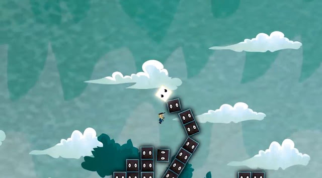
Destony, like the previously researched games is created by a single developer. The game is an atmospheric puzzle platformer with a very strong focus on story and feel. You play as a postman named Tony who previously died in a bus accident and his spirits was released in order to help those struggling with negative thoughts in their lives and help them fulfil their destiny. As you dive into their private subconscious, you can see all the blocks of negativity stored in their minds and can assist them in clearing out the negative blocks and collecting the positive blocks to progress through the game. As you progress throughout the game, the puzzles progressively become more difficult and if you don’t catch the positive block before it hits the ground, the fragile positivity fades away. 

This game, although short and very basic, holds a core sense of systemic worth and the art style really creates a sense of intrigue and wonder. The mechanic of jumping and pushing blocks out the way, although minimal, holds a substantial pleasurable response. The narrative of the game creates a sense of urgency and mission within the game as progress and tread carefully on the path to fulfilling your goals. 


Challenge 4/5: The balance of skill and challenge is amply accomplished with the playful nature of exploration and experimentation. The physics of the game create quite a challenge as your goal of reaching the positive blocks without letting them fall and can sometimes require skill and planning. The game can be contently played as time flies by as you find joy in jumping around and accessing one positive block to the other. Although it being a prototype, the sense of challenge is certainly not in full bloom and more features could be added.


Freedom 4/5: The game allows you to have a certain level of creative freedom to explore and effect your environment differently each time you touch the blocks from a different angle, velocity or even height and allows the player to define their own outcome. You are able to move around freely around the environment and there are no time restraints, although you are only limited to jumping. Despite this, the mechanic is pressure sensitive and requires certain jump heights to pass certain areas of the game.  


Retention 3/5: The game has enough content and story to keep the player engaged and content within the prototype. The freedoms to explore and effect your environment have quite an addictive nature all throughout the game. Each time you fail to collect the certain blocks, you are motivated to try and try again until you succeed. Although the game can become slightly repetitive when you collect blocks which are too easy again and again as well as the game lacking depth within the content and the amount of levels.


Immersion 4/5: The story creates an emotive vibe which is translated from the start of the game as you progress throughout. The visuals have a really vibrant and soft nature to them which draws the user within the experience. The world that is created has a really psychedelic dreamlike feel to it and when playing, you can get a sense of magical fantasy. The immersive qualities could be further expanded with more polish to the story, although after seeing the cut scene of the game and understanding the story, you begin to feel a connection with the purpose of the experience.  


Value 4/5: The game manages to balance the rewarding system very well. As you play throughout the game, 
you know that collecting 3 white blocks will bring you to the next level, each block you collect gives off a satisfying spark and make you feel you are progressing throughout. The general sense of the game is very pleasing, from the visuals, music to the polished jump, you feel that the game has had a lot of consideration put into it. There are also some small glitches with the re-spawn and game over screen which can slightly dampen the experience. Once you complete the game you are left feeling that it was too short being a prototype, and having more features and varied levels would create further value, although there is certainly much value within the game.


Feel 4/5: The feel is familiar to many early platformers, it’s a simple and barebones experience, although the simplicity maintains a sense of polished influence throughout. There is a certain amount of harmony in regards to the character, blocks and environment; the characters have box shaped body, although there is harmony within the spherical look within the eyes which unite well with the clouds and rounded aspects of the environment. Overall, the game has quite a unique feel in comparison to other platformers, one of a certain polish which certainly could be expanded on for an even more pleasing overall experience.   


RATING
CHALLENGE
4
FREEDOM
4
RETENTION
3
IMMERSION
4
VALUE
4
FEEL
4
TOTAL (Mean)
3.8


Table of results for Destony

In assessing all the factors of Destony, it is apparent that a lot of the game aesthetics are clearly well thought out and executed and incorporate prior research of successful games. The challenge, freedom, immersion, value and feel all score a high rating due to the certain level of polish created within several aspects of the game. The story, the art style, the programming of the simple jump mechanic are all done with meticulous attention to detail which potentially separate this game from other traditional platformers. The incorporation of physics and the innovative concept of collecting fragile blocks bring great prominence within the aesthetic experience of the game.


Although, to its detriment, it is also evident that it is a prototype and not a finished game. The retention factor suffers due to the certain lacking features such as a limited amount of levels, small glitches and program heavy features due to it being created by an artist. Despite these drawbacks, the game is certainly a well thought out prototype with much potential and values the majority of the elements presented within the framework.   


My Game is Finally Finished

Hard work beats Talent, when Talent Fails to Work Hard

That is one thing I wholeheartedly believe in, it isn't about how talented you are or how much you know, it's about the mindset and attutude you have when you do whatever you do. In regards to coding, it was something of a dream to me, somehting I felt I could never do or even slightly fathom. The brackets, the syntax, variables, funcations etc etc., they all scared me away.

Now after 8 months of learning as well as struggling to use Unity 3D pretty much alone (of course the Unity community and Internet were instrumental in my development), I have learnt so much and think back to when I started this project thinking I should play it safe and just draw or just do concept art of design stuff so I can land an easy job. Thinking back to those thoughts I am glad I didn't opt out and stuck with creating my own game. 


UPDATE:

Here is a video play-through of my finished game:

Friday, 10 May 2013

Destony Opening Animation

I believe that every great game takes full advantage of it's immersion abilities. Other than reading a book or reading text, to actually visualize and understand the characters and their roles within a game help the user to connect. In order for Destony to stand out from the crowd of games and to increase it's value and immersion, I wanted to have an opening animation to create more polish. Luckily help was at hand, as my family is from an enthusiastically creative background and both of my two brothers animate fora living.

Kensei Thomas 

Kensei, my brother was the perfect person to ask for something to be animated. He lives sleep and breathes animation and I told him about the opportunity to create something for my game early on and he was keen to help out, he was placed 2nd place within the famous red bull Canimation competition  losing out by a hair to a university graduate and he was only 18 back then.

You can see the entries here: http://canimation.redbull.co.uk/index.php/gallery

His Canimation animation is bellow: 


It was hard to convey the story of my game exactly as I wanted it as it is quite a unique concept having a ghost person jump into the mind of others. How that would go about happening and other things were unclear at first, although after meeting up with him in London (my home) and explaining it to him face to face and directing the process, he got the idea.


The above video is the final version that my brother sent me, the guitar music in the background he actually played himself as he plays the guitar as often if not more than he animates, which is a lot. In being critical about the video, my only main gripe was that the ghost could have been made slightly more transparent at the start. Also there were no sound effects which I thought would have really brought the animation to life. So I decided to add some:

UPDATE: video with added sound effects.


I feel that watching these two videos, with and without the sound effects show the power of audio and it's impact on the visual significance. In conclusion, I am very grateful and happy that he could contribute to my game and I think the opening animation explains the story in less than a minute in a creative and playful way.

Thursday, 9 May 2013

Supervisor Meeting: Dissertation 2nd Draft Feedback

The last meeting with my supervisor before the submission. My supervisor has been a great help in assisting my growth and developing me as a student. The MDA framework, articles by Clint Hocking and a lot of relevant material was discovered due to my supervisors knowledge and research area which at time overlapped with my research so I am glad he was my supervisor and his critical opinion always makes me rethink my approach, particularly in writing and designing a worthwhile experience.

The last meeting consisted of a massive run down of my 2nd draft and the corrections and feedback. This took up the whole 30 minutes and it is evident that there is always room for improvement and being a perfectionist I try to improve and close the skill gaps, in this situation, particularly to do with the dissertation. The meeting ran over the allocated time although the next student Micheal was ok with waiting a little while longer as I showed Dayna the latest progress of my work. Overall he was happy with it and gave me some crucial feedback for the last week before hand in.

Here is what we discussed in detail:

 Meeting Agenda:

·        Dissertation 2nd draft corrections and feedback.
·        Dissertation word count and how to get it down.
·        Show your most recent .exe file of the game and ask for feedback.
·        Learning contract needs to be signed again.
·        Honours Project Supervisor Meeting diaries need to be checked before the hand in.
·        Honours project hand in Questions:
o   What is needed?
o   1st semester work included?
o   Include the blog? What sort of posts?


Progress Report:

·        The Dissertation was drafted a 2nd time to further maximise feedback and assist in creating a well-polished academic piece of writing.
·        The dissertation has improved and there is little or no use of hyperbole or any unsupported terms.
·        The game now has a main menu, options menu, credits, blinking eyes for the boxes, explosion animations and the collecting of items brings you to the next level.
·        A new promotional poster has been created to showcase the game and to improve my personal aesthetic ability as well as compliment the game.


Agreed action points:

·        Send a final version of the dissertation that is print ready before submission to double check for any major errors.
·        Try and cut down on the word count by putting the analysis of Tony Wings and Thomas was Alone into the appendix, or by rewriting a few sections to decrease the word count.
·        Restructure the placement of your methodology.
·        Create a video of the gameplay for you game as the markers may not have the right software to play your game and it would be easier for them to assess.
·        Print out your work in silk or matte, as shiny posters can distract from your work when there is too much glare.

Wednesday, 8 May 2013

Why Business Cards?

Business Cards

Time is coming to a close on this computer arts degree, and it is time to start printing out the appropriate materials for the showcase and to create a gap of opportunity for employment.

One of those aspects, is the business card, a handy way of exposing what you are capable of within a small 89 × 51 mm piece of card. This was actually the first time I have never created a business card throughout my whole life, as back in collage we had created products and printed CVs which were showcased rather than business cards. Reflecting back on that experience, business cards are quite appropriate, for several reasons.

The following article discusses why I feel business cards are so important, not only for business but also for personal use: 
http://www.sessions.edu/notes-on-design/resources/design/why-business-cards-still-matter-in-the-digital-age/


Yes, it may be true that we have mobile phones and other means and methods of displaying and passing our contact information  although being able to brand yourself sufficiently counts for a great deal. People expect business cards from people who run a professional or freelance business, without them, it can insinuate that you do not take your business as seriously as other business owners.

Another key aspects of business cards are their ability to catch someones attention as well as to present your personality in a straight forward manner. Particularly for graphic designers and web designers, it opens up the playground for them to showcase their skills to the client which alone could possibly land them a job.

Why are they still being used today?

When I was in the process of creating my business card, the thought came to me, which was why are they so popular today among all the other methods of sharing your contact information and with new ways of sending business cards without manually typing in the information from a card. Methods such as 'bumping' or using QR codes don't seem to have clicked on fully as of yet.

This following articles discusses this situation:
http://www.networkworld.com/community/blog/why-business-cards-still-beat-%E2%80%98-bump%E2%80%99


It starts to ignite some sense when you think about it, if handing over a business card takes a few seconds to accomplish, as opposed to asking if the person has the said technology or software to 'bump' or take photos into software that register the details, this would prove cumbersome to many, particularly the more traditional parties.

Developing a Business Card

Having never created a business card, although having a very strong graphic design background, I started to do my research. My supervisor Dayna suggested a very useful website called Moo.com, which was the website which really made the whole process so simple and educational.

Creating a business card is not as simple as just created a design and that is it, you also need to consider the bleed, the printing quality, file format, the text quality and of course how you as a person wishes to present yourself.


Moo.com luckily offer out templates to clients with the correct file format, which they suggest is best with the use of a vector-based PDF. Pre-flight your PDFs using the 'Adobe PDF/X-1a' pre-set. It should also be with a CMYK colour format as opposed to RBG. All of these things are essential for achieving the maximum results in printing. 
Moo.com has a great slideshow which also details bleed, safe areas and trim within printing:
http://uk.moo.com/help/faq/yay-nay.html


Find their templates and design specifics for quality print results:
http://uk.moo.com/help/faq/templates-and-guidelines.html

Designing a Business Card

Ronan Quigley an audio student who helped me develop the audio for my game wanted a business card developed, so I decided to help assist him.

Before I designed my own, I designed Ronan's card as his design request was a minimalist design approach which seemed like a good experimenting option for designing my first business card.

I used Adobe Illustrator to create both business cards as I know from experience as a designer that vector based graphics (graphics which can be freely manipulated without loss in quality) are a lot more crisp when printed.

For Ronan's audio based business card I drew around an image of headphones with the pen tool. 


The concept was that the cable of the headphones would connect to the other side displaying the cable end. A minimalist approach, although a successful project in which I gained some key skilled in creating a business card.


I used the knowledge gained from creating Ronan's card to create my own one. I personally feel that creating a business card, most people go for 'less is more'. I also feel that if everyone is going for less is more, then I feel the 'less' ends up being 'less' as it is over saturated by many others who part take in the same concept. So I decided to go for a completely different direction.


Using Illustrator again, I decided to create a quirky and creative design which represents who I am as an artist. After a lot of research on other business cards out there, I then brought in all the collected resources into illustrator for inspiration, and then mocked up my own design concept.

Finding the right font and the right colours was the most time consuming aspect. As I started to polish the design for my details side, I realised that my design ability has grown so much within the past year, not only through practice  but through admiring the interface of windows 8. the trend in graphic design at the moment seems to be in using solid colours and clear sharp text, this is evident in windows 8 and was my main inspiration for the design.


After much tweaking and adjusting, I finally created something I felt really represented my art style and ability. Something that was dynamic, colorful with attention to detail. I then spent some time customizing two pieces of my art for the back cover. 

Bellow is the final result which I am happy with and quite excited for them to arrive on the 17th May:


Monday, 6 May 2013

The Power of Audio


Music makes a difference

A game is never really complete without audio, luckily I went in with creating this game with the full confidence of what kind of audio would best suit my game. The audio in Thomas was Alone is exactly the kind of audio that I feel would suit my game, the music within that game is emotive, moving and atmospheric, which is exactly the kind of effect I am hoping for in my game.

Doing some extensive research on Thomas was Alone, I discovered that the music was not just simply played level after level, although they had programmed a complex music system which combined certain sounds so every track is played differently on different levels with combining various stored sounds by random.

For more information on TWA development, visit his development blog that shows his progress throughout development:
http://thomaswasalone.wordpress.com/

Here is an example of the music composed for the game Thomas was Alone:


If you listen to the track above, you will hear a lot of synthesizers and bells as well as bit trip music which combines into a harmonious experience which suits the game adequately due to it's retro feel. I think that without the music that was implemented in Thomas was Alone along with the narration of Danny Wallace, the game would not have been half as established and well credited due to the immense capturing qualities they bring to a game.


Critique

My only gripe with the audio from Thomas was Alone is that they all start off slow and then take a long time before the rise of tempo arrives, and I think it works perfectly for a long game such as Thomas was Alone which roughly takes about 3 hours to complete, although my game is a simple prototype so for the music to rise in tempo a minute earlier or so would be great. 


Creative Application

One motto in life is that when you find something you are passionate about, you have to pursue it. When I properly listened to the music from Thomas was Alone during my case study play, I knew that the music wasn't ordinary, there was something special about it. The 'something' that was special, was that it was emotive and had such a rich depth to it. 

I thought that it was worth trying to achieve the same effect and I had a few options, I could start learning fruity loops again and create the sounds by myself, or I could find someone with adequate skills to try and produce something creatively similar.

So I managed to get a fellow Abertay 4th year student named Ronan Quigley who studies sound production to give me a hand, and in turn I would make him his business card, and seeing the graphic design is something I enjoy, I agreed.

I directed to him exactly what kind of sound I wanted and showed him three tracks form Thomas was Alone, as well as telling him about the wanted Tempo rise and he understood it straight away and within days he produced a few sounds which fit perfectly into the game and hold an emotional presence as I was hoping for. 

Here are the following sounds: 

Destony Level 1 Snippet


Destony Level 1 (Full Version)


Destony Level 2


*All sounds produced  by Ronan Quigley (University of Abertay Dundee)

Listening to the songs that were specifically created for the game I created bring a strange, but happy/proud feeling. After putting them into the game and testing it out, I really felt that all the hard work started to pay off and that the game was coming together.

Destony level 1 is quite upbeat and adventurous  after 40 seconds, the temp increases as the more synthesizing sounds come in and liven up the song. Destony Level 2 is soft with a harmonious piano and a wispy background them. Both sounds are very well made and further experimenting with them in Unity will be intriguing.

The sound of the snippet version is slightly louder than the full version although this can be easily tweaked and changed within Unity. Also the Level 1 sound is more pronounced and alive compared to Level 2, although Thomas was Alone was very similar in the quiet levels and their jumps to the loader levels.

In full consideration of these sounds, I am very excited to have these in the game replacing the placeholder Thomas was Alone sounds. Although the project is mainly focusing on visuals and systemics, the sound is a part of the game aesthetic and has a large contribution with the final polished product.

Friday, 3 May 2013

Artwork: where I used to be, where I am now

Personal Progress

It's funny how many artists never really feel that they are progressing with their art skills year after year, although I feel that is not realistic to think this way if you have deductive reasoning skills and if you are drawing even if it's less than once a week, if you really want to be a better artist, you do get better.

I realized that just by looking at things in a different way, it has helped develop my art skills. When I look at a person or an object with an art minded perspective instead of just looking, I start to gain a visual library which helps me develop my art and ability. Feng Zhu has a perfect video which explains exactly what I mean and he coined the term Visual Library which struck a chord with me. I feel that this past year has developed my visual library and I feel a lot more confident in drawing things entirely from my imagination. The video is bellow:


He gives the example of asking anyone to draw an 'Ant' and see what happens. Those who have seen a lot of ants or have studied them, or even better have drawn them before will have a much more accurate attempt at drawing an ant as opposed to those who have barely noticed the anatomy of an ant and not drawn them before.

A 5 min sketch with reference.

A 2-3 hour sketch of my promotional poster with no reference.

10 min rough thumbnail sketch of the level design.

15 min sketch of a life drawing model, then a further 10 mins to color it in with COPIC markers.

30 min sketch of the promotional concept art work which was later painted along with more art for the game. I could see that the COPIC markers helped define the style of art I was creating.

A more developed story board which I showed to my brother Kensei who animated from this scene with his own creative freedom. It displays a kid being bullied and then giving up on life in the middle of the road as a car beeps the horn, then Tony comes into his head to save him.

A development sketch of the Main Menu.

Figuring out the explosion animation and blinking of the blocks.

2 min quick thumbnail sketch of level design ideas.

2 min quick thumbnail sketch of level design ideas.

2 min quick thumbnail sketch of level design ideas.

2 min quick thumbnail sketch of level design ideas.

A 20 min sketch of an alternative design for the main character Tony as a robot. With a reference from the Edge magazine.

10 min sketch figuring out the poses of Tony following anatomy references.

10 min sketch figuring out the poses of Tony following anatomy references.

More alternative designs of Tony and some level design sketches.

Level 1 Concept Sketch:20 min sketch with art design and feel in focus for Level 1.


Level 2 Concept Sketch: A 15 min sketch with art design and feel in focus for Level 2.

Level 3 Concept Sketch: A 20 min sketch with art design and feel in focus for Level 3.


Level 4 Concept Sketch: A 20 min sketch with art design and feel in focus for Level 4.

Level 1: A more intermediate level design sketch of level one with the player experience at the forefront.

Level 2: A more intermediate level design sketch of level two with the player experience at the forefront. The blocks would fall down at a fast speed and you would have to catch the right one before it falls.

Level 3: A more intermediate level design sketch of level three with the player experience at the forefront. The introduction of the 'Big Bad Block'

Level 4: A more intermediate level design sketch of level four with the player experience at the forefront. The longest level with a surprise at the end.