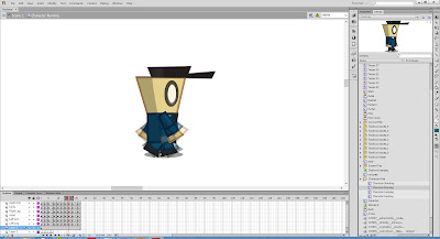
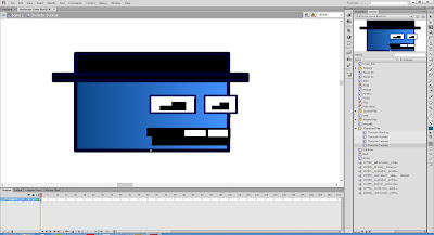
The Menu Screen
As you can see, the above images of the menu screen are fairly different in their appearance. The BlueBOX game displays an image of the character which blinks as it sits still. The font is also very different and gives off a very different aesthetic image to the users. I personally prefer the Destony menu screen as it is very modern and stands out, although it could do with an animated background or subtle movements to increase it's overall visual appeal.
The Rules Section
The retro screen has very obvious arrows which to some may challenge the users competence, which is why they were removed in the screenshot bellow. Overall they both fulfill their purpose and display rules of the game both very clearly. The modern assets replace the older ones and have a lot more character to them.
Level 1
Now getting to the actual meat of the game, we come to the actual gameplay of the games themselves. Yes, the framework is the exact same, although the actual experience is changed simply by a change of art, and this seeks to extrapolate and discuss this.
The first thing that I noticed was that the Box platformer character moves around in a very comical way and has a lot of comical appeal in their aesthetic appearance whereas the Destony character moves around a lot more smoothly and has a much more organic feel. Both games have a very nice feel and have a certain amount of polish. Playing level 1 I noticed that the ground was effected by the platform detection system within Destony and the ground changed to being quite rugged and bumpy in which added some depth to the gameplay.
Walking Animation
Comparing the walk cycle from the retro to the modern, playing the cycle within the game you instantly notice that the box walk is extremely limited as the box has no legs and just sways side to side. Thomas was alone goes a step further with this simplicity in which there is not cycle and the square glides across the floor.
It is clear that having a walk cycle and also an added shadow brings a lot more realism and somehow brings more visual value and a sense of fluidity.
Jumping Animation
The jump animation in the retro image is less realistic although is actually in my opinion a better jump, it gives a comical and satisfying sense within the jump, so noting this it might be best to try and add comical aspects to the characters jump.
Crouching Animation
The crouching animation is again suits the retro side of things more as it holds that unrealistic comical sense of squash and stretch which could be used for the Destony character as well. The crouching within the game on Level 4 actually requires for the Retro Box to duck in order to reach the portal, although due to the size of the Destony character's head, the crouching didn't make much of a difference and thus the platform was lowered to allow easy access to the portal in Destony Level 4.
Level 3
Notice within the new image above that the shadow is still present when the character is in midair which is a fault that can be fixed with some research in order to only have a shadow when the character is on the ground. Within Level 3 the atmosphere really looks quite different compared to the retro version and the mechanic of jump and the angle of the platforms are effected by the extra height of the Destony character and the bumpy platforms.
Level 4
As said previously, the last platform on level 4 on the right requires a crouch manauver in order to enter the portal, although on the modern version of the game, it was not necessary as the ducking made little difference to the characters height. Although some tweaking in the characters animation could easily change this. The different of the characters and the background give this particular level a lot of appeal in the modern version.
Level 5
Within the 5th level, there are finally some diagonal slopes involved which are very straight within the retro box version of the game although within the Destony version they are still bumpy and this gives a different effect when going down the platform. This in my opinion didn't feel too different when everything was already so unstable, although in the retro version it gave a new feeling of slanted discovery.
Evaluation
Mechanics: Upon evaluating the overall performance of both games it is obvious that which one would be perceived as 'better' would be purely based on opinion. In my opinion, the manipulation of mechanic which really shined through is within the jump function within the last levels of the game. I actually found that the jump feeling on the 6th level to be highly satisfying and rewarding within the retro game, although the accuracy and the precise factor of the game is effected by a lot of the messy collision/connection detection of the art work, so I would actually say that the mechanics that are kept simple actually feeling better overall.
Aesthetics: As for the aesthetics, I would say that the overall appeal and feel of the BlueBOX platformer is a more complete retro experience than the half formed Destony prototype and that there is a lot of potential within the experience of this prototype although there is much that need to be tweaked and focused upon to bring this change. By in large I think that the Destony game has a substantial amount of visual appeal and definitely would bring a lot more interest to most audiences in my opinion and experience. The character moves a lot more smoothly within the modern version and have a lot more professional appeal. Although the sound and music I feel suits the BlueBOX a lot more, this could be adjusted with a more atmospheric and less upbeat and high sound during gameplay. Both games are fairly polished as prototypes and display the sheer potential that subtle changes within the art and sound can make a difference.
Overall, it is clear to me that BlueBOX game is more complete as a prototype and that the aesthetic experience really suits the game whereas the Destony game still has much to be fleshed out and polished before it can stand alone as a unique and cohesive experience. In saying that, the mechanics seem to be amplified when aesthetics are kept simple and upgrading aesthetics brings a lot more fluidity to a game.


No comments:
Post a Comment