
Last Years Showcase Examples
I have been doing a lot of thinking in terms of my showcase and how to best present my work and unlike my opinion of business cards, I feel that with exhibitions, less 'IS' actually more and that is the only way to stand out, the only way to stand out is to have less in a more refined way when everyone else is crowding their showcase space with little consideration or planning in their exact execution.

Having a look at the showcase examples form last year, my precise point of the work fading into the noise of all the other images holds true. It sounds harsh considering that they have spent so much time creating their work, although as Ken Fee my lecturer once taught me, 'presentation is everything' and I now live by that statement and make sure I present everything well, as before I was so concerned with the actuality and tangibleness of the product and now I feel that presentation holds more weight and it's more the way you present rather than the content. If you do not present it well, people will not even give you the time of day to come over and see your work.
I have marked red circles the above examples which I feel executed the less is more theory and done it in a way that I feel is correct and with much consideration. Those are the best examples in my critical view as they are organised in a way that is very purposeful and pays great attention to laws of composition.
Best Examples:
Claire Moncrieff
I have chosen this example as one of the best as it is the perfect example of someone who understands the power of white/empty space and doesn't feel the need to fill up the whole space, yet understands that there is power in created absence around you to emphasize the weight/strength of the end product in it's own space.
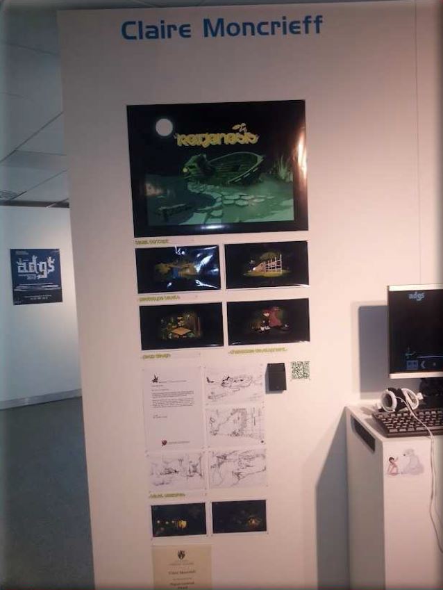
Pros:
- The work is very clean and visually appealing.
- There is a certain amount of flow in the way the work is arranged and the way your eye follows from top to bottom.
- Less is more.
Cons:
- There may not be enough production work to show off due to the less is more theory.
- Contrast between white paper on white paper is minimal and thus fades into the back.
- The work at the bottom has text and may be hard to read.
Holly Martin
This example was chosen for opposite reasons, it was chose not because it has less, but chosen because the arrangement of the content is well well organised and well thought out that it proves to be effective as a showcase piece. The sense of empty space is also well done and just like Claire's showcase, it leads your eyes to the top where her final project work lies. This is a great set up with a great awareness of space.

Pros:
- The work has been arranged well and the placement of colour is well thought out.
- There is a certain amount of flow in the way the work is arranged and the way your eye follows up to the final product work of the cans.
- Lots of production work on show.
Cons:
- There isn't much empty space and less is more was not fully applied.
- The work at the bottom may be hard to see.
No comments:
Post a Comment