Sunday, 13 January 2013

Mechanic Development: Prototype DESTONY

After creating BlueBOX platformer which was a very basic platforming game which I managed to code myself, it was time to test out the same game fundamentals with more polished art to see if it really makes a difference, so I used the art assets of the concept art and created new assets to polish the game and see how it comes across.

Creation of Level 1: replacing old art

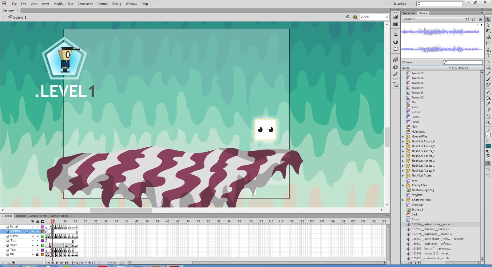
In order to get the new game with the new art running, the process consisted with changing the art assets that were embedded within the movie clips and replacing them with the newer assets.

Creation of Level 3: shifting platform positions

Here I was changing the assets within Level 3 and adjusting the Vcam within the game.

Creation of Level 6: duplicating platforms


This was adjusting level 6 which had the most platforms so took the most amount of time to adjust and change.

Menu Screen: much more vibrant

As you can see the opening screen is a lot more vibrant and catching than the blueBOX Screen.

Rules Screen: less busy and more simple

The RULES screen is also a lot more vibrant and the design is lot less in your face than previously.

In Game Testing: The game played quite differently

Overall, when playing the game with the new graphics, I noticed a lot of differences within the gameplay, the character felt different when moving around and the whole game experience was a bit more versatile.

You can play the actual game with the link bellow:

Destony Platformer Game Link


Upon evaluating the whole game experience, it was obvious to me that the graphics do effect the gameplay, the character moved around differently and the game gave a different vibe when being experienced. Because the ground is formulated by relating the main characters spacial surrounding and then combining that with the floor, you often can get glitch effects within the interaction of the two objects within the game.

This I found to be particularly true within Level 6, when the character tries to jump on the various platforms, you can see how the character is effected by the angles of the platforms and how he doesn't just travel directly upwards.

Overall, the game does play differently and looks a lot more polished, although from my evaluation I feel it is fair to say that the overall gaming experience is pioneered by the gameplay and primarily how the game has been programmed, which is what I really want to focus on in more depth within the 2nd semester of this project. Overall, I am happy with the transfer and how I learnt so much from this process and it is time to use what was learned a create a new developed experience. 

Friday, 11 January 2013

Unite with Unity


So after a lot of browsing, I have decided that for my honours project, I will be using Unity to create my 2D platformer, it took quite a lot of convincing but after some research and actually using Unity itself, I found out how it's a really straight forward piece of software and is far more powerful than Flash is in terms of it's capabilities. So because of this I thought it was worth getting involved with and finally uniting with Unity.

This was the post that changed my mind:

Unity London Meet: Creating 2D Platformers


In the above talk which is in the link, Tom Jackson AKA Quickfingers talks about game development and how he got into it. He started out as a graphic designer within the games industry, then he moved on to designing video games starting out with using flash. His games were successful gaining millions of views, so he decided to take it up more seriously and got jobs as a programmer and designer. He later discovered Unity and stopped using Flash due to it's cross-platforming ability and it's huge database of knowledge and user help.


Quickfingers created the above game 'Boom Bugs' using Unity and changing the camera to a front on view which makes the 3D planes with 2D images on them look like it is a 2D game, he explains in detail how it is built and that it also runs on Unity's physics engine. All of these things are the reasons why i feel unity will be a great place to start in creating a more in depth game and also Thomas was Alone by Mike Bethel was also created using Unity. 

Using Unity


After playing around with unity for a while, I created a simple platformer character and also a pause menu and I found it fairly easy to use, especially being the first time. Unity is easy to use although like every game developing software requires the user to know how to code certain aspects of the game which will be my biggest struggle, although with the Unity community support and sheer determination, I feel confident that I can produce a high quality game after much iteration. 

Aesthetic Development: New Game: Destony

 After a lot of development work within my sketchbook, I came up with an idea for my honours project which I am very happy about and happy to explore in the future. After much development and concept work, it was time to finally get going with the more final concept work for the game. This process was made extremely easy due to the prior concept work that was put into the pre-production phase.

Game Branding: Logo


The logo for the game went through many iterations before it came to this stage. Before this logo was created, I followed the sketches from my sketchbook and created very block like text and they really didn't look like they suited the game or the idea of a 'destiny' theme. So after some iterations I created various different mash ups of fonts until I got to the stage where I realized that the text didn't look right because there was no light glow or positive colour to bring out the font. A lot of the attempts were with just the black glow and gave it quite a negative image. This was the final iteration 


Game Branding: Concept Art/ Promotional Art


After the logo was created, I moved on to creating the visual feel of the game through a piece of concept art. The colours weren't so clear at the start so a lot of refinements were made. In my mind I had a lot of colours which I thought would correlate well. Key colours that were often used were blue, black and white. These are the main colours which are used for the main characters outfit. The dark blocks are coloured with a very dark purple and a blue boundary which helps the user to see the block against darker environments. 

Game Art: In-Game Mock up art


Finally, to further illustrate the overall feel of the game, the only way to fully envision what the game is going to be like is to see the actual gameplay style or look. This mock up shows a very intermediate outlook of what this game will look like. I always knew in my mind that I wanted the environment to look unique and quirky as if it was in a dream world. Similar to a 'Pychonauts' feel of a game that really takes you away into a different world. The characters and the artwork also need to really mesh together well, which is what I really tried to focus on. It was also important to make sure that the colours and the features within the level do not clash too much and to dull the aspects which are too loud. In the end I think it really turned out quite well and all the material really speaks louder than words and all blend together well.

Tuesday, 8 January 2013

Creating the Art of Destony using Illustrator

From a sketch to a Vector art piece

I always prefer to use illustrator when creating art for anything that might turn out that it is in need of re-scaling. This is because Illustrator uses vector based graphics. This basically means that no matter how big you scale the object or how small, the actual pixels will not be rastorized in a random algorithm which loses quality. So in simple terms, it manages to preserve image quality no matter how you scale it.

The bottom section of the bellow sketch is the sketch that I used for my illustrated piece.


The first step was to crop the section of the image that I wanted and to import the image into Illustrator.


After the image was edited and imported into illustrator, it looked like the above.

Then inside illustrator, I always separate the different art pieces on different layers. Then it's a matter of drawing out each part within Illustrator. Usually I draw out each part with the pen tool although if I used the pen tool to draw each individual swirling line I would have been there for several hours detailing them. Instead I draw the outside of the object and then I use the scissors tool  cut each of the inside of each object, I do this with the control of the graphics tablet to get smoother results than a mouse. 

Developing the character was a matter of creating boxed objects and then manipulating those objects to fit his shape, this was far easier than drawing it freehand or using the pen tool.

The dark boxes were also quite simple, again using simple shapes and manipulating them for the right fit. The blue outline is an outline stroke with the weight of 1 of the box.

The sea was also created using the same technique as the purple rocks, using the scissors tool. 

As for the light box, it was created as a simple white object and the an outer glow was applied to it form the effects menu.

The clouds and the trees were drawn out with the paintbrush tool and then were also cut up with the scissors tool on the outer areas to produce the lighting highlight. This is a simple and effective technique.

Final Image


My Thoughts

I was fairly  pleased with the final outcome as the colours and the crispness of Illustrator create a clean and attractive scene. The white box also stands out as originally intended due to its glow and there is a certain amount of contrast when comparing it with the dark blocks. I like the organic feel to the image and feel that when polished and put into a game it could look quite interesting and possible somewhat psychedelic

Pros:

  • The vibrancy of the colours bring out the characters and the environment.
  • The white box has contrasting features compared with the dark blocks and this shows that there is a clear separation between the two. 
  • The clouds look organic and hand drawn in a cartoon style which is cohesive with the rest of the work.

Cons:

  • The background is quite noisy and can detract from the main characters and environment.
  • There may be too much detail within the environment which may confuse people or create a sense of of distaste when viewing this art piece or particularly when playing the game.

Possible Improvements:

  • Overall, I feel this is very close to the final art for the game. Possible improvements would be to dull the background or remove some detail within the background. Also putting a texture on top of the art would help subdue it and prevent the strong separation of line and colour.

Monday, 7 January 2013

DESTONY: Theoretic Planning

Theoretic Planning: Developing the concept

Before developing the game, it is imperative to make a list of things that actually need to be done for the game to be made. These things don't have to be final, although created a foundation for a game to be developed properly and consistently. As they say, the six 'P's': proper prior planning prevents poor performance.
The above was a task breakdown of Destony for what particular tasks needed to be done for the game to be accomplished. 


Listing the required software and the art style of the game as well as any other aspects that may be relevant. 


How was this game going to achieve Systemic and Aesthetic Significance? that was the main question, and I generally feel that this question would be answered properly after the case studies were developed and more research had taken place. Desipte this, I stated that the art style and the jump mechanic would be an essential part in creating such significance.