Friday, 3 May 2013

Artwork: where I used to be, where I am now

Personal Progress

It's funny how many artists never really feel that they are progressing with their art skills year after year, although I feel that is not realistic to think this way if you have deductive reasoning skills and if you are drawing even if it's less than once a week, if you really want to be a better artist, you do get better.

I realized that just by looking at things in a different way, it has helped develop my art skills. When I look at a person or an object with an art minded perspective instead of just looking, I start to gain a visual library which helps me develop my art and ability. Feng Zhu has a perfect video which explains exactly what I mean and he coined the term Visual Library which struck a chord with me. I feel that this past year has developed my visual library and I feel a lot more confident in drawing things entirely from my imagination. The video is bellow:


He gives the example of asking anyone to draw an 'Ant' and see what happens. Those who have seen a lot of ants or have studied them, or even better have drawn them before will have a much more accurate attempt at drawing an ant as opposed to those who have barely noticed the anatomy of an ant and not drawn them before.

A 5 min sketch with reference.

A 2-3 hour sketch of my promotional poster with no reference.

10 min rough thumbnail sketch of the level design.

15 min sketch of a life drawing model, then a further 10 mins to color it in with COPIC markers.

30 min sketch of the promotional concept art work which was later painted along with more art for the game. I could see that the COPIC markers helped define the style of art I was creating.

A more developed story board which I showed to my brother Kensei who animated from this scene with his own creative freedom. It displays a kid being bullied and then giving up on life in the middle of the road as a car beeps the horn, then Tony comes into his head to save him.

A development sketch of the Main Menu.

Figuring out the explosion animation and blinking of the blocks.

2 min quick thumbnail sketch of level design ideas.

2 min quick thumbnail sketch of level design ideas.

2 min quick thumbnail sketch of level design ideas.

2 min quick thumbnail sketch of level design ideas.

A 20 min sketch of an alternative design for the main character Tony as a robot. With a reference from the Edge magazine.

10 min sketch figuring out the poses of Tony following anatomy references.

10 min sketch figuring out the poses of Tony following anatomy references.

More alternative designs of Tony and some level design sketches.

Level 1 Concept Sketch:20 min sketch with art design and feel in focus for Level 1.


Level 2 Concept Sketch: A 15 min sketch with art design and feel in focus for Level 2.

Level 3 Concept Sketch: A 20 min sketch with art design and feel in focus for Level 3.


Level 4 Concept Sketch: A 20 min sketch with art design and feel in focus for Level 4.

Level 1: A more intermediate level design sketch of level one with the player experience at the forefront.

Level 2: A more intermediate level design sketch of level two with the player experience at the forefront. The blocks would fall down at a fast speed and you would have to catch the right one before it falls.

Level 3: A more intermediate level design sketch of level three with the player experience at the forefront. The introduction of the 'Big Bad Block'

Level 4: A more intermediate level design sketch of level four with the player experience at the forefront. The longest level with a surprise at the end.


Tuesday, 30 April 2013

The Real Story

The Reason why Destony is called Des'Tony'

The story of Destony is actually inspired by a friend of mine named Tony who passed away in 2010 in a bus accident. Tony was from France and attended a youth workout to help out as a team leader in Holland. On his way back on the Eurolines bus, the bus crashed and he was the only passenger to pass away from the accident.

Tony Yuen 1989-2010

Tony was one of the most sweet and gentle people you could ever meet. He had a great positive nature about him and always liked to encourage and help people. In the game Destony, the character is based on him, trying to push away the negativity and help people find that glint of hope.

I feel that video game and entertainment and art mediums should not be used only for stimulation and entertainment sake and feel that inspiring, moving and educating people through media is a great concept. Throughout my game Destony, I would somewhat like to influence people to think more about their lives and the situations they face, and try and grab that positive light within their lives whilst they have the opportunity. 

Story Structure

 Every game has a story or a setting, during game development, it starts to become more clear how important it is to structure the game and the events. In Thomas was alone, during development, Mike Bithell created a simple structure for his game which inspired me to keep a similar structure for my game.

In his diagram, he lists all the characters in the game and their abilities and weaknesses or personalities. This creates a clear reference point if there is any confusion in the future.

Thomas was Alone Game Design: Character/Story/Colour/Music Mood

The bottom half of the diagram displays what each story act represents followed by the colour and mood/music that each act represents. This kind of structure is the kind of structure which helps a designer focus more on the aesthetics of a game rather than the quick fix or stimulation. 

Destony Story Structure

  1. Tony - a gentle hero who jumps his way to helping other see the light and unleash their destiny.
  2. Negative Block - a lazy block filled with negativity.
  3. Light Box - a fragile block with much potential and unharvested energy.

Story


ACT 1
Tony goes into the mind of someone who is struggling with depression at school. As he enters his mind, an alternate expression of his thoughts, he wonders the environment looking for the light blocks. He has to collect 3 positive blocks in order to liberate the person's mind. 

Colour/ Music Mood
  • Warmth
  • Newness
  • Adventure

ACT 2
Tony starts to get the hang of these alternate worlds and catching the light boxes before they fall. Although the levels begin to become more difficult as he has to think fast to save the light boxes. Each level he passes, he enters the mind of someone else. 

Colour/ Music Mood
  • Surprise
  • Shock
  • Overcoming
  • Calm

ACT 3
Tony reaches the final level, this level is different, there is a large negative block with no means to get around it and he has to find the courage to push it out the way. As it often is the case that our fears are nothing but an illusion. Once you push the large block out the way, you are presented with the last light box which moves you to a cut scenes which ends the game. 

Colour/ Music Mood
  • Courage
  • Strength
  • Hope
  • Detiny

Monday, 29 April 2013

Honours Project Podcast: Exposing the Exposition

Another podcast, this time, discussing the DO's and DON'TS within a showcase and what my personal as well as research based thoughts are on effectively presenting your work and doing it justice. Find out more bellow:

Podcast: Exposing the Exposition 


Sunday, 28 April 2013

Exhibiton Plan Update


The Updated Plan

I have now put a lot more thought into the execution of my showcase as well as thought about the spacing and the sizes of everything. It turns out that an A1 poster is certainly too big and would not be appropriate for my work piece. So I am now going for A2 instead which is a lot more appropriate.

Some major changes are that I have decided to add production work, I have also decided to add paper crafted models of the characters of the game. The promotional blocks on the right will be cubes that stick out of the wall which will give it a very nice 3D look. I have added signs which indicate 'PLAY THE GAME' and 'PLEASE TAKE ONE' which I hope will subliminally influence people to take action. I also plan on using one of the blocks to hold my business cards as well as host my project description. This is the current plan which I am quite happy with although everything is still subject to change during the actual final exposition  especially after seeing my space and how much of the computer gets in the way.


Pros:

  • Much more detail and content specific to the exposition requirements.
  • The new 3D assets will bring a sense of dynamism. 
  • Addition of production work is a great plus for others to see the progress and development of the game.
  • The business cards have a placeholder and object of attention.
  • Included signs for the people who visit for extra clarity.

Cons:

  • It will be fairly expensive to print all the required prints as well as time consuming to create the 3D assets.
  • There may be too much clutter and you may be going against the less is more rule.
  • The work at the bottom has text and may be hard to read.

The Tangible Test

In order for the exhibition to go smoothly, I felt that it wasn't enough to just print things our and hope for the best when it comes to sticking them up on the stands. So I took things into my own hands in creating a 7 foot by 4 foot space. This was done DIY style with a measuring tape and two ties that would be pinned to the top. It has created a great sense of space for me to understand what I am dealing with in a more tangible manner.

The bellow images are a duplication of my design above being put into real use on my bedroom wall. As you can see, they are all placeholder pieces of paper, although the size is fairly accurate to the final exhibition.

The only poster that is not made to size is the Isocronous A3 poster which will be replaced with a large A2 image that will pop out.

Here you can see a close up of how things look. I also made a fake name tag which in the exhibition will be replaced with vinyl text.

Here is another view from the other side and I think that if I manage to post everything as shown here, that the project will prove to be effective as planned. 


Saturday, 27 April 2013

Art Design: Developing my Style


As a means of developing my personal art style as well as having something more to show fro the exposition. I decided that a refinement of my previous promotional material was necessary as the main DESTONY logo/text had changed as well as the general feel of the game has become more minimal.

Inspiration

My inspiration for this poster design actually came from this year's Dare to be Digital poster. I felt that the composition and  the use of colours was exactly how I saw Destony in my mind and as a designer I just knew immediately that it was something that connected with my vision. The way that everything is centered and just pops out of the darker background with a subtle gradient, it was a perfect composition which inspired to sketch something out.


In terms of the actual art process, I was very much inspired by Jen Zee: http://jenzee.deviantart.com/

The way she paints her pictures with such vivid colours and a soft brush stroke appearance is a large inspiration and I tried to study her variety of colour and tone within the art I was developing.


The Sketch

After being inspired by the poster above, I spent some time sketching and ended up with the bellow result which was my inspiration to have a more dynamic way of presenting my game concept.

The sketch was done with a 2B pencil on sketchbook paper and took around 2-3 hours roughly.

The next step was to put the image into Photoshop.

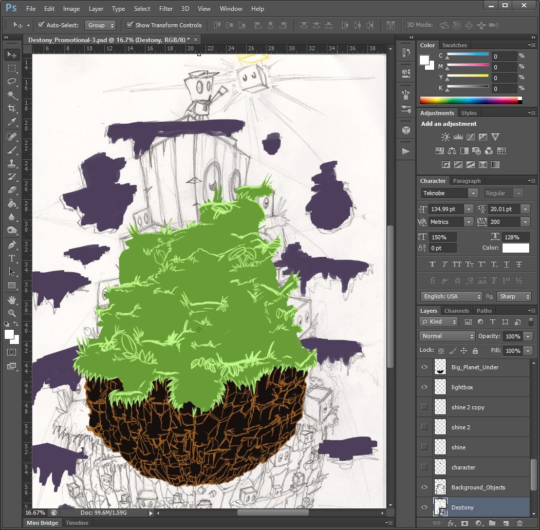
After that, I started with blocking out the details of the main objects such as the grass and the rocks. I did this using a rounded paint brush with shape dynamics and transition set to pen pressure with my Wacom tablet.

Blocking out the rocks and experimenting with colour.

The next step was to start shading the grass, this was probably the most time consuming thing ever and I actually learnt a faster way to draw detail and hold the illusion of detail which saved me a lot of time. As half way through after 4-6 hours, I felt like there must be a better way and there way.

I then started to block in the main character which I wanted to be more polished than my previous poster character. To give it more polish and retain my own art style.

The next step was to do the dark block characters, this was probably the most enjoyable, playing around with lighting and using different tones of purple and blue to get a nice polished effect. I also added the shading to the rocks which was far quicker than the grass.

A close up of the detail.

The next step was to start drawing in the flowers and mushrooms, which looks like there was little effort put in although each asset takes at least 15-20 minutes to paint. I had to account the lightning and the shadows also.

I then created the eyes for the blocks using a one set of eyes and duplicating them and changing them throughout to fit the perspective of each block.

The last few steps was to add the blue line of each dark block, this was done by holding SHIFT and clicking from corner to corner to get straight line.

Then next and final stage was playing around with the composition and the effects of the image as well as the background. I also lost the planet debris in the background as I felt it wasn't needed and would distract the focal point of the image.

Here I was playing around with the background and effects as well as the placement of the new logo for the game. This is the new logo which I felt suited the game more and seems far more professional. 

Final Image

 
This was the final result after a lot of thought and re-positioning.

My Thoughts

The final result was far batter than I expected it to look when I first started painting the image, the way the dark blocks pop out and are of high detail and appropriate perspective was a real surprise for me as I began to paint the image. The character and the light box also compliment those features also, and it is clear that the focal point is further up in the image. Starting from the dark bottom of the rocks, all the way up to the Destony title. I spent 3 days non stop painting the image and I feel that the time and effort paid off and there is far less to fault this image in comparison to my other artworks. 

Pros:

  • The colours of the main drawing pop out due to the subtle background.
  • The detail of the grass and other features is far beyond anything I have every produced.
  • It looks like a professional poster that is well polished.
  • The perspective is spot on or close to being so.
  • It is an eye catching piece of work with great use of tonal shading and harmony of colours.
  • There is great complimentary shadows and colour use (purple/yellow, green/red).

Cons:

  • The character is quite small so for some people it might be hard to understand that he is the main protagonist. 
  • The bright light of the light box should maybe cast a stronger light to the rest of the environment.
  • Another version of the background with a more painted look might have also worked well.

Possible Improvements:

  • Nothing that comes to mind, although it would be nice to see what it would look like with more things in the background. Overall, it is certainly my best piece of digital painting so far.


Here is a section I customized and cropped for my business card.