
As a means of developing my personal art style as well as having something more to show fro the exposition. I decided that a refinement of my previous promotional material was necessary as the main DESTONY logo/text had changed as well as the general feel of the game has become more minimal.
Inspiration
My inspiration for this poster design actually came from this year's Dare to be Digital poster. I felt that the composition and the use of colours was exactly how I saw Destony in my mind and as a designer I just knew immediately that it was something that connected with my vision. The way that everything is centered and just pops out of the darker background with a subtle gradient, it was a perfect composition which inspired to sketch something out.

In terms of the actual art process, I was very much inspired by Jen Zee: http://jenzee.deviantart.com/
The way she paints her pictures with such vivid colours and a soft brush stroke appearance is a large inspiration and I tried to study her variety of colour and tone within the art I was developing.
The way she paints her pictures with such vivid colours and a soft brush stroke appearance is a large inspiration and I tried to study her variety of colour and tone within the art I was developing.

The Sketch
After being inspired by the poster above, I spent some time sketching and ended up with the bellow result which was my inspiration to have a more dynamic way of presenting my game concept.

The sketch was done with a 2B pencil on sketchbook paper and took around 2-3 hours roughly.

The next step was to put the image into Photoshop.

After that, I started with blocking out the details of the main objects such as the grass and the rocks. I did this using a rounded paint brush with shape dynamics and transition set to pen pressure with my Wacom tablet.
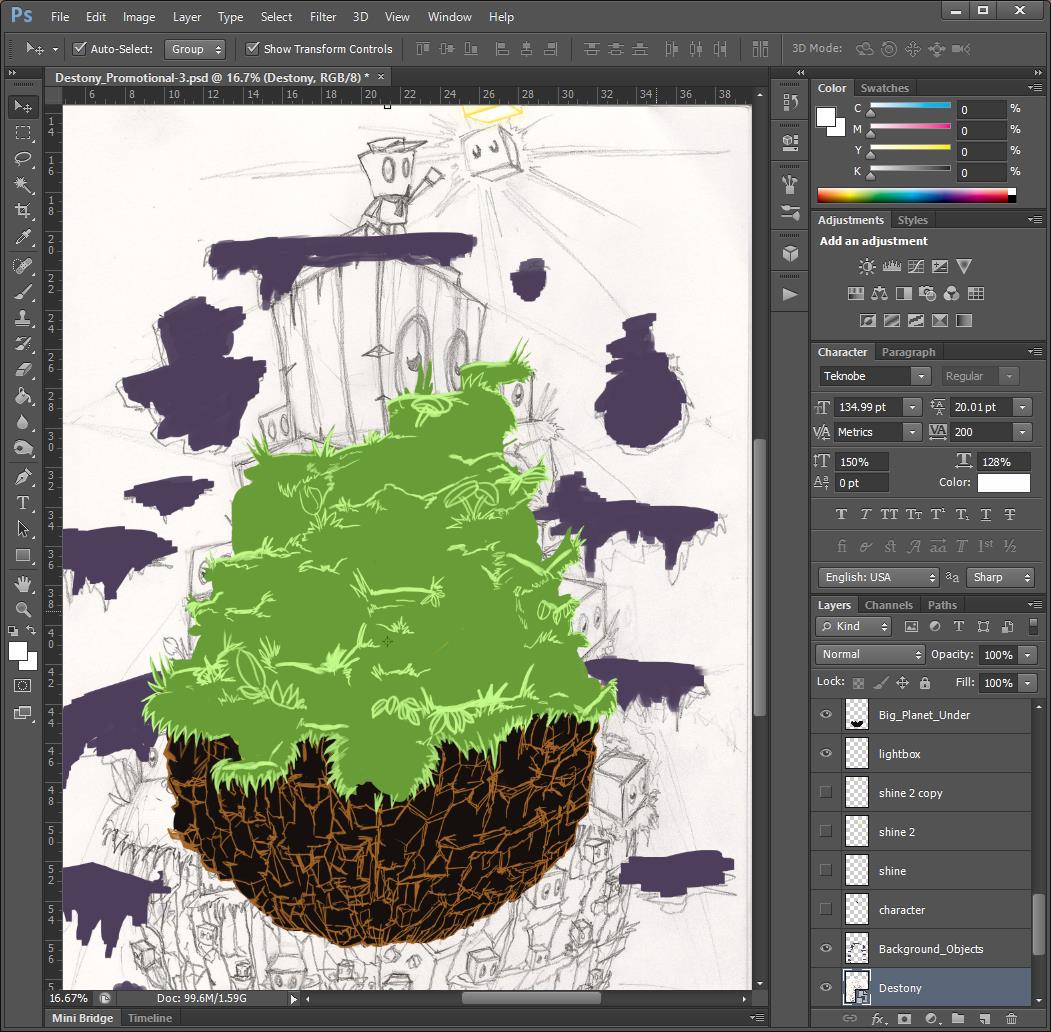
Blocking out the rocks and experimenting with colour.

The next step was to start shading the grass, this was probably the most time consuming thing ever and I actually learnt a faster way to draw detail and hold the illusion of detail which saved me a lot of time. As half way through after 4-6 hours, I felt like there must be a better way and there way.

I then started to block in the main character which I wanted to be more polished than my previous poster character. To give it more polish and retain my own art style.

The next step was to do the dark block characters, this was probably the most enjoyable, playing around with lighting and using different tones of purple and blue to get a nice polished effect. I also added the shading to the rocks which was far quicker than the grass.

A close up of the detail.

The next step was to start drawing in the flowers and mushrooms, which looks like there was little effort put in although each asset takes at least 15-20 minutes to paint. I had to account the lightning and the shadows also.

I then created the eyes for the blocks using a one set of eyes and duplicating them and changing them throughout to fit the perspective of each block.

The last few steps was to add the blue line of each dark block, this was done by holding SHIFT and clicking from corner to corner to get straight line.

Then next and final stage was playing around with the composition and the effects of the image as well as the background. I also lost the planet debris in the background as I felt it wasn't needed and would distract the focal point of the image.


Here I was playing around with the background and effects as well as the placement of the new logo for the game. This is the new logo which I felt suited the game more and seems far more professional.
Final Image

This was the final result after a lot of thought and re-positioning.
My Thoughts
The final result was far batter than I expected it to look when I first started painting the image, the way the dark blocks pop out and are of high detail and appropriate perspective was a real surprise for me as I began to paint the image. The character and the light box also compliment those features also, and it is clear that the focal point is further up in the image. Starting from the dark bottom of the rocks, all the way up to the Destony title. I spent 3 days non stop painting the image and I feel that the time and effort paid off and there is far less to fault this image in comparison to my other artworks.
Pros:
- The colours of the main drawing pop out due to the subtle background.
- The detail of the grass and other features is far beyond anything I have every produced.
- It looks like a professional poster that is well polished.
- The perspective is spot on or close to being so.
- It is an eye catching piece of work with great use of tonal shading and harmony of colours.
- There is great complimentary shadows and colour use (purple/yellow, green/red).
Cons:
- The character is quite small so for some people it might be hard to understand that he is the main protagonist.
- The bright light of the light box should maybe cast a stronger light to the rest of the environment.
- Another version of the background with a more painted look might have also worked well.
Possible Improvements:
- Nothing that comes to mind, although it would be nice to see what it would look like with more things in the background. Overall, it is certainly my best piece of digital painting so far.

Here is a section I customized and cropped for my business card.
No comments:
Post a Comment