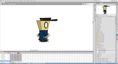
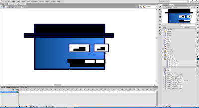
Thursday 31 January 2013

Presentation is Everything (Exposition)

Exposition or Exhibition?

ex·po·si·tion  (ksp-zshn)
n.
1. A setting forth of meaning or intent.
2.
a. A statement or rhetorical discourse intended to give information about or an explanation of difficult material.
b. The art or technique of composing such discourses.
3. Music
a. The first part of a composition in sonata form that introduces the themes.
b. The opening section of a fugue.
4. The part of a play that provides the background information needed to understand the characters and the action.
5. An act or example of exposing.
6. A public exhibition or show, as of artistic or industrial developments.

ex·hi·bi·tion  (ks-bshn)
n.
1. The act or an instance of exhibiting.
2. Something exhibited; an exhibit.
3. A large-scale public showing, as of art objects or industrial or agricultural products.
4. Chiefly British A grant given to a scholar by a school or university.


What Exhibitions look like and Why it Matters?
Like I said in my previous post about making your exhibition stand out, presentation is everything, the comment from my lecturer Ken Fee after I did not do so well in his module due to the way I handed in my work. I learnt that lesson the hard way that day and it has been etched into me to this day. 

So why is presentation so important? and why does an exhibition matter so much? 
Some non art-savvy or design people might say that an exhibition is just some print outs of paper or a few strokes of a brush so it is all the same. In the design world, that couldn't be further from the truth or at least the perceived truth in regards to aesthetic execution and it being well defined. In terms of the appearance of an exhibition  it is essential that every single bit of work that is displayed has its purpose and has it's place, as every mark you make or picture you place on that wall is instantly perceived as intentional and often it is. 


It matters because the people that go and check out exhibitions are not just normal people with no art background, the people that attend exhibitions regularly do so because the work o display is of interest to the as it usually relates to their professional or passionate field of work. This means that they understand design theory, colour, composition and are on the look out for those pieces of work that do something interesting and do something that is of high standard as that is why they come to exhibitions  to see works of high standard or interest.


The above photo shows a similar set up that we are also going to have in our exhibition.

The bellow set up is reminiscent of a product design showcase.

Having photo frames does make a difference and also offers a certain level of protection for your work.


The text DUI that is cut in half has individual light and really stands out in comparison to the rest of the work.


The tight composition really works here.


Less is more certainly works here for these square shaped works.


Work that is able to pop out in a 3D sense does have a certain level of impact that flat work doesn't have.


Having work that is not as straightly aligned yet holds up a center line also works.


Canvas prints and using materials is also a great way to showcase your work.

Work that fits in an almost puzzle like way to form a square is an interesting concept of presentation also.


Work with a black paper backing create a natural pop out sense in presentation.


Work with large text and specific placement also creates a difference.


You also have to consider the public and their way of getting around within the exhibition.

Monday 28 January 2013

Researching Mechanics: Creating 'Depth'

A great Gamasutra article talks about the depth of a game mechanic and what really brings an emphasis to what a great mechanic is all about and how those aspects can be amplified. I feel that it is important to experiment with certain game mechanics and see what really makes them 'click' and draw the user into played a game. Coming to think of it, there have been so many games with so many different game mechanics which each create a different aspect for the user to feel accomplished or to feel a certain depth within the game.

The article opens up with explaining how games often look great on paper, but when you test out the game to see how it plays, games often end up feeling repetitive and needing more variety, that is probably one of the hardest things to master in game creation, the question now is, how do we master this.

As explained within previous research, a lot of this is to do with the actual challenge you present the player, if it is not challenging enough or engaging enough, the user will lose interest. A great example of this for me was within Assassin's Creed on the Xbox 360, I remember being really excited to first start playing the game and then as I started to play the game for a few hours, I got hit with feelings or boredom and repetition as the whole game was just about doing the same exact thing over and over again multiple times without much variation or increased challenge.

Assassin's Creed experience of repetition
The main game mechanic within Assassin's Creed was within the stealth kill or assassination of the enemy, this is what would bring about a great sense of pride and establishment for the player as they feel that they have conquered the enemy and achieved a great feat by not being seen. This got repetitive because I felt that even as I was doing this over and over again, the thrill of the first kill was diminished by the same thing happening over and over again and little change within the game environment or difficulty. 

In the Gamasutra article it defines the method to solve and it also explains why this problem often occurs.
  • Buzzwords to watch for: The game is "a one-trick pony," "repetitive," "or needs more variety."
  • Feedback that can be fixed with these kind of content expansions tends to describe the game as a whole. Players feel they don't have enough different things to do on a global level.

The ways that Gamastura suggests in general to solve this is:

If players feel that an individual game mechanic is flat and unrewarding you can refine that mechanic's "theatrics" by giving the player better feedback, more rewards, better effects, cooler sounds, more personality, a cooler camera, or other bells and whistles. After theatrics refinements, players will often -- with no changes to the underlying gameplay -- tell you the problem is fixed.


So the whole point of this is that if your users or testers do not find much fun within your mechanic or find it boring after a few goes, then this is the issue, the game mechanic needs more depth. The whole article goes into detail on how you can prevent 'Shallow' game mechanics which cause games to be boring, flat or repetitive.

In the article, he goes on to explaint that there are two things that are needed in order for the game to achieve any depth within it. These are:

  • It needs clear objectives, so the player knows what he has to do to succeed. Confusion and obfuscation tend to make players feel like a mechanic is LESS deep once they find themselves needing to experiment randomly to win.
  • It needs a variety of Meaningful Skills that you, as a game designer, can use to create good challenges for the player and that the player in turn can use to achieve mastery over the game.


So those two things are 'Objectives' and 'Meaningful Skills' which define and create the game to make it what it is. The separation between these two aspects are probably the most important things within the design of an in-depth mechanic.

A good example they make; is where if the mechanic is just a means to do an objective and has no meaningful skills, then it sort just dismisses the purpose of the game. The objective cannot be a brain dead activity of getting form A to B but has to invoke the player to display a certain amount of skill, meaningful skill.

At the end of the day, meaningful skills contribute much more to deep mechanics than the objectives within the game do. 

So that means that most games that don't feel deep enough feel that way because they have way more objectives and not enough meaningful skills. This is exactly why Assassin's Creed was boring, it kept repeating the same objectives over and over again and had little skill change involved to make the game interesting enough for longer periods of time.

The article then goes on to explain activity statements which involve naming what the meaningful skill is and what the objective is, and if it is too vague, the gameplay often suffers.

Here is the five step process which he explains:

1. Identify and list your objectives.
a. For each, ask yourself: "Is this objective functionally a duplicate of any of the other objectives in my list?" If it is, ask yourself if you really need it. Do you really want to spend the time on teaching your players how to interact with it? If the answer is no, cross it out.
2. Identify and list all your meaningful skills.
a. For each ask yourself: "Is this really a meaningful skill? Not too basic? Not an objective?"
b. Ask yourself: "Is this skill functionally a duplicate of any of the other meaningful skills in my list?" If it is, cross it out. You're tricking yourself into thinking you have more skills than you actually do.
Having taken stock, do you now find you have too many objectives? Not enough meaningful skills? At this point, I'll bet you've discovered that, yes, somehow that's happened. At this point, just do the same exercise I suggested above to help my past-self get over his tractor beam problems:
1. Add one or more new meaningful skills to the list.
a. As you add them, ask yourself the same questions as above. "Is this skill really meaningful? Is it too basic? Is it really an objective?"
2. Go through all your challenges and improve your Activity Statements
3. Prototype the new content.
4. Play-test. Is your problem solved? If so, then you're done!
5. If your problem isn't solved, go back to step 1 and try again.

This has been rather insightful, I'll definitely continue to read articles on 'depth' and what influences the mechanics within a system.

Monday 21 January 2013

34°C to -1°C, Hot to Cold & Schedule

Just getting back from Australia and visiting my girlfriend, it is now time to get back to work, I feel that this blog has been rather regimented and structured in it's appearance so far and I want to mix it up with more honest accounts of my own personal life and my progress.

Working on my coursework in Australia, Brisbane was at times a struggle, as the heat is insane and it often can dishearten one to keep on working when it is so hot. Luckily, there was air conditioning where I was staying, so it made things more bearable.

The hand in period has just ended and being back to the UK ad seeing that the whole of the UK is plunged in snow is quite the contrast to the former heated experience of everything being overwhelmingly hot. From one extreme to another it made me really think about working conditions and what working conditions est suit me when I work. Being in Australia and working from home, I realized that working from Home is quite difficult and that working in a library or at University is a much more conducive atmosphere to gaining a better work output ratio. I also think that it helps to work when it colder rather than it being hotter, you actually are inspired to get things done when the cold keeps you on your feet.

For the next few months, I have previously created a schedule of how things are going to proceed from now on and I am quite excited to get things going. My schedule will be quite intense and I plan to keep it that way and to really challenge myself to getting things done and pushing my current talents and abilities.


As said within the schedule, this week will be all about creating a outcomes that focus on game mechanics and that will be my focus as I start to create various aspects of my final piece.

The overall project that I create has to have some meaning and some depth and to create a theory which is very easy to understand and easy to use and interpret, throughout this project, I hope to really challenge myself and what I am used to to create things that I haven't really created before. This project gives me the opportunity to discover my passion and create a basis to help others find aspects of their passion within their gaming experience.

Looking at the schedule again, it seems like a reasonable amount to ask for and I feel that if I follow the schedule as it is meant to be followed, that I will be able to really succeed within creating this project and creating a final outcome that I and many others can really enjoy so it's enough of talking (that's for the dissertation) and more time for action.

Thursday 17 January 2013

Creating Promotional Art for Destony

From a sketch to a digital art piece

When setting out to create a game poster, in depth of research needs to be done in order to decide exactly what you are trying to execute with your design. 

After researching games that i felt had a similar feel to the game I was developing, I came across a FEZ poster which I felt really embodied what my game was about. An exploring positive character with an adventure as well as a mission. 

This is the FEZ poster which was the main inspiration for my poster, it was quite a coincidence that so many aspects of this certain poster matched my game. 


Here is the sketch that I produced after some thinking about the game environment and the positioning of the objects. 


Digital Development

I created the poster in Photoshop, this is the tool I usually use when I paint a digital image. 


I first lay out the scanned sketch in the background and lower the opacity so that I can actually see what I am drawing on top.

This was actually the last step, fitting in the appropriate font, this actually took me a long time as I couldn't quite find one that fitted so I ended up have to customize a font.

The initial painting phase always starts with the main focal point in the picture, in this picture, it happens to be the main character. This painting is done with a rounded paintbrush and using a wacom fun and touch tablet.

After the main character is done, I usually move onto the enemies and other characters within the game. I used the shift button to create the straight lines for the boxes.

I also added a glow around the white box which is done with the layer effects and glow function and can be adjusted so it doesn't look as tacky.

Finally, the last step was to do the background which consisted of filling it up with clouds and the two colored platforms. The background was a gradient made and adjusted with the gradient tool and the clouds and ground were all painted. 


Final Image


My Thoughts

The final result was more than I expected when I first set out to produce this piece of art. I was fairly surprise by how much it pops out from the screen due to the vibrant use of colours. It took a fair while to create although was certainly a worthwhile investment. I feel that it appropriately displays a positive stream of energy which my game will have when collecting the light boxes, although there is also room for improvement.

Pros:

  • The colours pop out in vibrancy due to the strong use of colours which liven up the piece.
  • The colours also compliment each other well. The purple of the background and the yellow of the light box, as well as the main title and the dark boxes also correlate.
  • The text also pops out due to the glow behind  it and the black mist also brings it out. 
  • The white box looks innocent, almost as if it was a glowing deity which was the intended look.
  • It is quite a fairly eye catching poster. 

Cons:

  • There are not enough dark blocks in the image, they somewhat seems bare and empty.
  • There could possibly be an inconsistency in the art style comparing the characters with the background. The characters are in almost solid like colors  in a cartoon like way, whereas the actual background looks very painted. 
  • The clouds were quite rushed and do not carry the same level of detail as the rest of the art piece.
  • The colours could be seen as too vibrant, and could be seen as means of covering up a possible lack of creativity within the picture. 

Possible Improvements:

  • There certainly could be more dark blocks on screen as inside the game the dark blocks significantly outnumber the light blocks.
  • The background and the clouds could also be improved to suit the style of the characters. 


Tuesday 15 January 2013

Game Comparison: Retro VS Modern

As said in my proposal, it is very important to access the aspects of the effectiveness of the mechanics and the aesthetics. Throughout this pre-production process of creating these two prototypes and comparing the art, it was obvious that the aesthetics of a game actually influence the overall experience. This will be a critical analysis of the two games and will access the pros and the cons of the different styles.

The Menu Screen


As you can see, the above images of the menu screen are fairly different in their appearance. The BlueBOX game displays an image of the character which blinks as it sits still. The font is also very different and gives off a very different aesthetic image to the users. I personally prefer the Destony menu screen as it is very modern and stands out, although it could do with an animated background or subtle movements to increase it's overall visual appeal. 


The Rules Section


The retro screen has very obvious arrows which to some may challenge the users competence, which is why they were removed in the screenshot bellow. Overall they both fulfill their purpose and display rules of the game both very clearly. The modern assets replace the older ones and have a lot more character to them.


Level 1 

Now getting to the actual meat of the game, we come to the actual gameplay of the games themselves. Yes, the framework is the exact same, although the actual experience is changed simply by a change of art, and this seeks to extrapolate and discuss this.

The first thing that I noticed was that the Box platformer character moves around in a very comical way and has a lot of comical appeal in their aesthetic appearance whereas the Destony character moves around a lot more smoothly and has a much more organic feel. Both games have a very nice feel and have a certain amount of polish. Playing level 1 I noticed that the ground was effected by the platform detection system within Destony and the ground changed to being quite rugged and bumpy in which added some depth to the gameplay.


Walking Animation


Comparing the walk cycle from the retro to the modern, playing the cycle within the game you instantly notice that the box walk is extremely limited as the box has no legs and just sways side to side. Thomas was alone goes a step further with this simplicity in which there is not cycle and the square glides across the floor.

It is clear that having a walk cycle and also an added shadow brings a lot more realism and somehow brings more visual value and a sense of fluidity.


Jumping Animation


The jump animation in the retro image is less realistic although is actually in my opinion a better jump, it gives a comical and satisfying sense within the jump, so noting this it might be best to try and add comical aspects to the characters jump. 


Crouching Animation


The crouching animation is again suits the retro side of things more as it holds that unrealistic comical sense of squash and stretch which could be used for the Destony character as well. The crouching within the game on Level 4 actually requires for the Retro Box to duck in order to reach the portal, although due to the size of the Destony character's head, the crouching didn't make much of a difference and thus the platform was lowered to allow easy access to the portal in Destony Level 4.


Level 3


Notice within the new image above that the shadow is still present when the character is in midair which is a fault that can be fixed with some research in order to only have a shadow when the character is on the ground. Within Level 3 the atmosphere really looks quite different compared to the retro version and the mechanic of jump and the angle of the platforms are effected by the extra height of the Destony character and the bumpy platforms.


Level 4


As said previously, the last platform on level 4 on the right requires a crouch manauver in order to enter the portal, although on the modern version of the game, it was not necessary as the ducking made little difference to the characters height. Although some tweaking in the characters animation could easily change this. The different of the characters and the background give this particular level a lot of appeal in the modern version.


Level 5


Within the 5th level, there are finally some diagonal slopes involved which are very straight within the retro box version of the game although within the Destony version they are still bumpy and this gives a different effect when going down the platform. This in my opinion didn't feel too different when everything was already so unstable, although in the retro version it gave a new feeling of slanted discovery.

Evaluation

Mechanics: Upon evaluating the overall performance of both games it is obvious that which one would be perceived as 'better' would be purely based on opinion. In my opinion, the manipulation of mechanic which really shined through is within the jump function within the last levels of the game. I actually found that the jump feeling on the 6th level to be highly satisfying and rewarding within the retro game, although the accuracy and the precise factor of the game is effected by a lot of the messy collision/connection detection of the art work, so I would actually say that the mechanics that are kept simple actually feeling better overall.

Aesthetics: As for the aesthetics, I would say that the overall appeal and feel of the BlueBOX platformer is a more complete retro experience than the half formed Destony prototype and that there is a lot of potential within the experience of this prototype although there is much that need to be tweaked and focused upon to bring this change. By in large I think that the Destony game has a substantial amount of visual appeal and definitely would bring a lot more interest to most audiences in my opinion and experience. The character moves a lot more smoothly within the modern version and have a lot more professional appeal. Although the sound and music I feel suits the BlueBOX a lot more, this could be adjusted with a more atmospheric and less upbeat and high sound during gameplay. Both games are fairly polished as prototypes and display the sheer potential that subtle changes within the art and sound can make a difference.

Overall, it is clear to me that BlueBOX game is more complete as a prototype and that the aesthetic experience really suits the game whereas the Destony game still has much to be fleshed out and polished before it can stand alone as a unique and cohesive experience. In saying that, the mechanics seem to be amplified when aesthetics are kept simple and upgrading aesthetics brings a lot more fluidity to a game.